Quantcast
Channel: Adweek Feed
Viewing all 10140 articles
Browse latest View live

Lockheed Martin Rigged a School Bus With 'Group VR' to Take Kids on a Tour of Mars

$
0
0

A group of kids in Washington, D.C., thought they were taking an ordinary school-bus ride to the USA Science and Engineering Festival recently. But much to their surprise, they suddenly took a detour—to Mars. 

This was thanks to Lockheed Martin, which created, with help from McCann and Framestore, the Lockheed Martin Mars Experience Bus, in which the windows of a bus were turned into screens and a "group VR" experience made the pint-size riders feel like they were traveling around the surface of the Red Planet.

The video below shows the stunt in action, and it's clear the kids were thrilled to have made a journey to a neighboring planet in seconds that normally takes the fastest spacecraft several months. 


Framestore, which virtually traveled to Mars when it did special effects for The Martian (it also won an Oscar for Gravity), replicated 200 square miles of the Martian surface for the bus trip. The students came from Girls Inc. and 4H. 

The bus trip is part of a larger campaign from the aerospace company called "Generation Beyond," a national Science, Technology, Engineering and Math educational program that aims to bring the science of space to homes and classrooms across America and get more kids to pursue STEM careers. 

"Our children—the elementary, middle and high school students of today—make up a generation that will change our universe forever. This is the generation that will walk on Mars, explore deep space and unlock mysteries that we can't yet imagine," said Marillyn Hewson, Lockheed Martin chairman, president and CEO.

"They won't get there alone. It is our job to prepare, inspire and equip them to build the future—and that's exactly what Generation Beyond is designed to do."


This Pet Store Tried to Sell a 'Gay Turtle' and Here's How Shoppers Reacted

$
0
0

Reminding us that people are judgmental jerks regardless of nationality, creed or religion, Amnesty International and TBWA Istanbul created the #GayTurtle project, which mocks the absurdity of homophobic attitudes. 

Homophobic violence is a big problem in Turkey, and this campaign tries using humor—and hidden cameras—as a leveling mechanism of sorts. 


In the video, an aquarium employee tells shoppers that a turtle they've chosen to buy is gay, and their reactions are what you'd expect: Some think it's a contagious illness, one guy drops a Turkish F-bomb, and many customers think that merely entertaining the idea of a gay turtle is indecent. 

The quick transition between admiring something cute and feeling uncomfortable—perhaps threatened—by the idea that it could be gay is what this project is spotlighting. 

We hope that #GayTurtle hits people where they live, if only because the dialogue surrounding this situation is ridiculous. The line "Give me a normal, non-gay, standard turtle" sounds like a quote from a Judd Apatow film. 

This Agency Is Selling Its Rejected Creative Work From 3 Pitches on eBay

$
0
0

Just because an advertising idea has been rejected in a pitch doesn't mean it isn't good. Or at least, it doesn't mean it can't have value—to someone else.

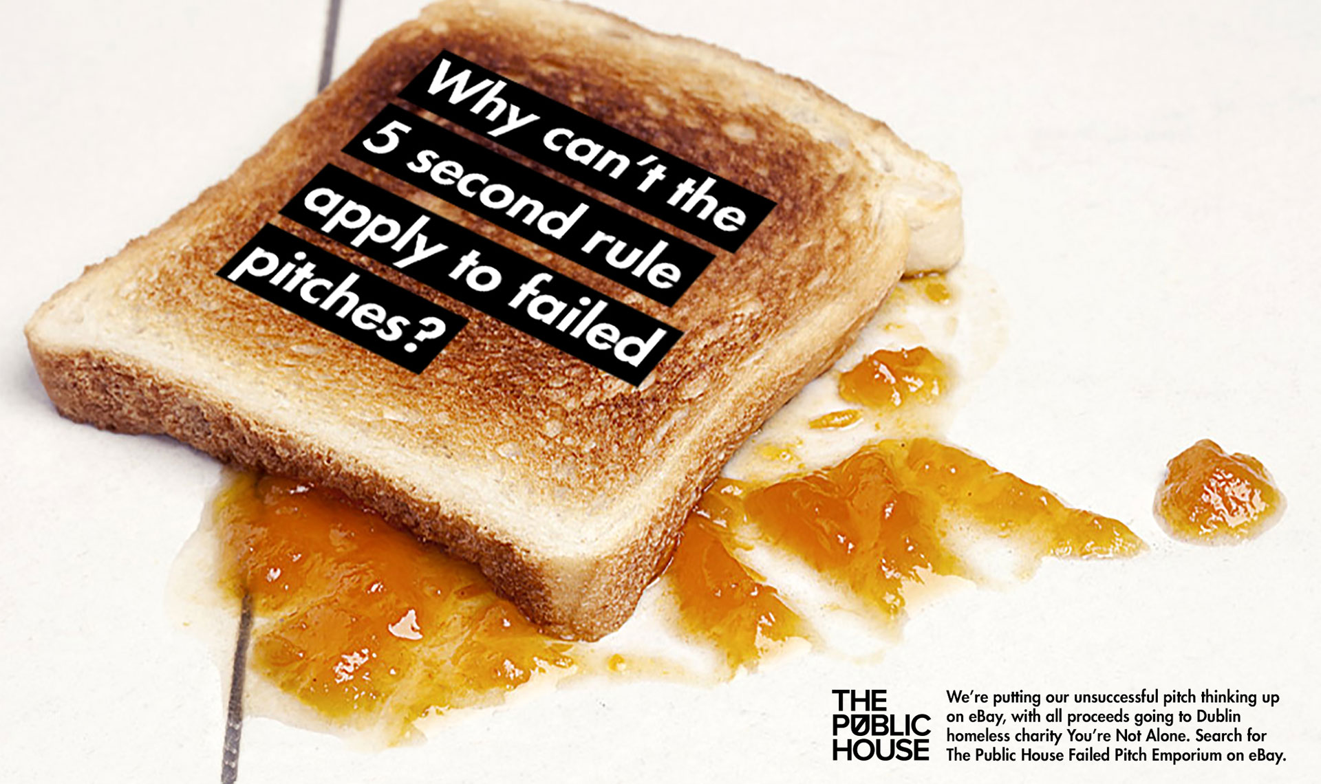
Dublin agency The Public House, unable to let go of its orphaned ideas, is putting them up for auction on eBay, with proceeds going to charity You're Not Alone. The ideas come from three failed pitches—for a potato chip company, tire servicing company and auto insurance company.

Bidding is currently at 1.26 euros for each idea. You can see all three auctions, and bid of them, at an eBay page called The Public House Failed Pitch Emporium.

"Droga5 aside, losing pitches is an inevitable part of the business," the agency tells us. "But at The Public House we don't like to take no for an answer. We've decided to brush off some of our rejected pitch work and sell it to highest bidder. … Any bids will be like finding money in the couch cushions anyway."

The agency adds: "As they say, one man's trash is another's fully formed, multi-platform, through-the-line, potentially award-winning campaign."


We spoke with creative director Jarrod Banadyga about the stunt:

AdFreak: Tell me about how this idea came about.
Jarrod Banadyga: Equal parts sour grapes and not wanting to let go of what we think are good ideas. It started as a bit of a joke suggestion after an unsuccessful pitch, but then it built from there. We figured someone might find a bunch of good thinking for a nominal bid, or they might feel like they got a box of old military medals that are of no use to them. Either way, it's exciting opening up a mystery box, or Storage Wars wouldn't have such high ratings.

Are you worried about giving a peek under the hood of the agency like this?
We're fortunate at The Public House. We don't pitch often, so we don't have to deal with the heartbreak as much. We've been fortunate to pick up new work through word of mouth, having casual conversations with clients that end with us humbly asking for them to give us one brief to prove ourselves. It almost always ends up with more briefs. We have no qualms in sharing "pitch-losing" work. We're proud of the work, and hate to see it gather cobwebs when it might do another company some good. We think every agency wishes they could share their rejected pitch ideas with a client that might be more open to their thinking. In the case of one pitch, the client wanted more "coupon-driven" concepts. And that's not really our style.

You've started the bidding low. What's the fair price for one of these ideas?
We're not expecting a huge bidding war. A minor skirmish would be nice. We certainly think they are worth more than 99 cents, but to be honest, we've already done the work for nothing, so this would be a bit like finding money down the back of the sofa. Also, these ideas are already what we would call "lost," so being able to resurrect ideas and give them another chance at making it is what makes us tick. Like that warm feeling you get when you watch Toy Story. 

Chilling Australian PSA Shows How Boys Learn Domestic Abuse ... and Girls Learn to Forgive

$
0
0

Knocking a girl over isn't just flirting, a new PSA from Australia reminds us—it's an early sign of contempt for women that could lead to more serious acts later in life.

The chilling ad, created by the government and agency BMF to prevent violence against women in future generations, features an escalating montage of disconcerting scenarios.

First, a boy slams a door in a girl's face, knocking her onto the floor. Her mother quickly forgives the bad behavior with the old "He just did it 'cause he likes you"—an act that causes the boy's momentarily conflicted face to smoothen with certainty as he runs off. 

Next, a father at an afternoon cookout tells his son not to throw like a girl (phrasing against which Always has made powerful rebuttals). The camera cuts to the quiet—but crestfallen—face of the boy's catch partner: a girl. 

Then, a teenage boy at a house party snaps a photo down the shirt of a girl who's bent to pick something up, turning to share it with a friend as she backs away, embarrassed and afraid. A boy sitting nearby looks visibly uncomfortable, but says nothing. 

Fast forward to adulthood, where a couple are arguing inside a car. The man, furious, storms out of the vehicle and into the parking lot, but not before banging on the passenger side window, inches from his partner's face. "You're OK," she tells herself. "He loves you."


In the PSA's final scene, a man chases a woman up the stairs, yelling and charging as she backs away—eventually tripping and falling backwards. He towers over her as she cowers, terrified. The light flickers, and in front of her stands the same boy from the first scene. 

"Violence against women starts with disrespect," says the voiceover. "The excuses we make allow it to grow. Let's stop it at the start." 

It's a skillfully produced piece of messaging—one that's upsetting at first watch, but gets increasingly disturbing on repeat viewings. The boy's expression in the first scene, for example, feels more and more sinister. All the segments are well staged and acted, with a richness of detail and precision in the subtext of the performances. 

In the men, a growing disrespect for women manifests in casual, dehumanizing disregard, or unchecked physical rage. In the women, we witness trembling panic or hyperventilation, and meager attempts to rationalize away fear. The cues are so efficient that it's almost easy to miss their full depth and impact. 

But the ad also makes such deft use of repetition—slamming doors are one theme, and the echoing excuses for worsening violence throughout different stages of life—that the final point punches through clearly. It's all the more resonant for the fact that most of these incidents seem trivial to many.

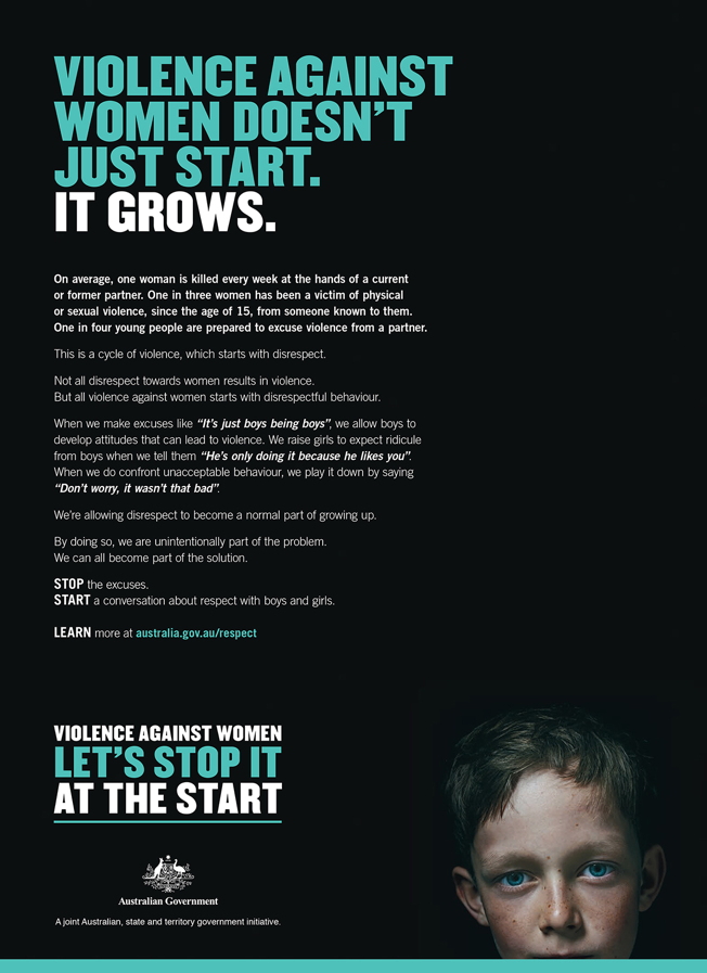
A pair of print ads explain in more detail why they aren't. They include awful statistics around the issue, like how, every week, one woman in Australia is killed by a current or former partner.

For anyone who needs further convincing, in the U.S. it's more like three a day.


CREDITS

Agency: BMF
Executive Creative Director: Cam Blackley
Associate Creative Director: Tim Bishop
Art Director: Bettina Clark
Copywriters: Tom Johnson and Tim Bishop
Head of Planning: Hugh Munro
Head of Client and Business Innovation: Kura Tyerman
Account Director: Kyle Abshoff
Account Manager: Siena Shuttler
Senior Producer: Mel Herbert

Production Company: Finch
Director: Derin Seale
Producer: Karen Bryson

Post Production: ALT FX
Editor: Drew Thompson @ ARC
Sound Production: Sonar
DoP: Matt Toll
Client Services Director: Clare Yardley

Art Buyer: Basir Salleh
Agency Print Producer: Karen Liddle

Photography Production House: Chee Productions
Photographer: Toby Dixon
Producer: Tamiko Wafer

Dove Moves Away From Social Experiments in Its Latest Ad About Loving Your Hair

$
0
0

Women buck hair conventions in Dove's latest campaign, from Havas Helia, which tells women they should wear their hair however they like—despite societal pressures to fit into narrow standards of what we believe to be beautiful hair. 

Using the insight that eight out of 10 women feel pressured to wear their hair a certain way, Dove interviews a variety of women about their hair. With that in mind, it's not surprising each of them share experiences where they've been chastised or made to feel uncomfortable about their choices. 

"A friend once told me if I put color back on my hair, it would make me look better," says Leecie, a woman with grey hair. Another woman, Aster, shares that she's been criticized for straightening her hair, "as if straightening it means I don't embrace who I am." 


"Our research indicated that the vast majority of women don't actually love their hair, and most feel tremendous pressure to conform to societal beauty norms. This was heartbreaking to us," Rob Candelino, vp of marketing and general manager of hair care at Unilever, said in a statement.  

"The Dove #LoveYourHair initiative is designed to celebrate all the wonderful, real-life stories of women who choose to quiet these outside pressures and wear their hair the way they themselves feel most beautiful and confident."

The 85-second film moves away from Dove's standard approach for a message like this—there's no social experiment where the women learn that their hair is beautiful, or that they can now love themselves—and the spot is better for it. (Dove addressed the issue of young girls not liking their curly hair in a spot last year.)

That said, the film's ambitions are grander than its results. It's almost too short for how quickly it shifts tones. The women share their disappointing stories for the first 20 or so seconds before "Express Yourself" blasts in and they're shown celebrating their "unconventional" hair choices. 

Google Translate Totally Fails Foreign Couples Trying to Say Their Wedding Vows in English

$
0
0

Dearly beloved, we are gathered here to join these couples in holy matrimony. And to compare ElaN Languages with Google Translate when it comes to translating international couple's wedding vows, written in their native languages, to English. 

In this amusing campaign for ElaN, from J. Walter Thompson Amsterdam, three real couples—not actors—ran the vows through both online translation tools, and read the results in English at their actual ceremonies. The translations were derived from Hindi, Portuguese, Spanish, Polish, Dutch and Norwegian. 

One shoot took place at a wedding, one during a rehearsal and another at a renewal of vows. In each case, the bride and groom were in on the joke, "but the double vows were a surprise to many of the guests," agency executive creative director Bas Korsten tells AdFreak.

As for the presence of commercial film crews, well, "they must have just thought their friends decided to really splurge on the wedding videography." 

Watch the spot here: 


Needless to say, Google's translations go awkwardly awry, though "I promise to grow old with you and keep your children alive" has a certain forthright charm, as does "I promise to be the best me that fits your best regional areas." 

Alas, telling a bride "You're my biggest size" won't win a groom many points (though if she said that to him... well, anyway). 

ElaN's translations, meanwhile, include more traditional-sounding sentiments, such as "I'm forever changed because of who you are and what you mean to me" and "I couldn't imagine growing old with anyone else." Aww… 

The campaign, titled "Promise the Translation," follows last year's Epica Grand Prix-winning "Taste the Translation," in which a Japanese recipe was translated by both Google and ElaN, with the results prepared by a chef and tasted by passersby. 

" 'Taste the Translation' was good because it put translations into such an unusual context," Korsten says. "So, when coming up with the next campaign, we tried to think about what other senses we could tap into. The idea of weddings felt right because they're so serious, and that heavy emotion was a great foil for the humor of a bad translation." 

While the new clip makes a memorable case for ElaN, "Taste" seems a bit stronger, because the translations were presented as direct comparisons. For example, ElaN's "boil the spinach" was followed by Google's "rape the spinach." (Clearly an act best avoided.) 

Conversely, in the wedding clip, we get a batch of bad Google translations followed by various on-point ElaN translations; there's no real correlation.

According to Korsten, "It doesn't work to go back and forth from funny to emotional every time. Plus, we're not visualizing the translation itself, only verbalizing, so that also adds another reason to group funny and emotional and not go side by side." 

Apologies, JWT—we know it's bad form to object at weddings.

CREDITS
Client: ElaN Languages
Business Development Director, Management Team Lead: Johan Noël

Agency: J. Walter Thompson Amsterdam
Executive Creative Director, Copy: Bas Korsten
Senior Creative, Art: Guney Soykan
Senior Creative, Copy: Kasia Haupt Canning
Strategy Director: Daan de Raaf
Strategist: Lex Notenboom
Concept Producer: Linda Jansen
Screen Producers: Lotte de Rooij, Mariska Fransen
Designer: Ronald Mica

Production Compagny: Brenninkmeijer & Isaacs
Postproduction, Editing, Visual Effects: The Ambassadors
Director: Joe Roberts
Director of Photography: Job Kraaijeveld

Here Are the Year's 4 Best Out-of-Home Campaigns, as Judged by the OBIE Awards

$
0
0

The Outdoor Advertising Association of America gave out its 2016 OBIE Awards for the year's best out-of-home advertising in Boca Raton, Fla., this week. Four agencies walked off with Best of Show prizes—for innovative and beautifully designed outdoor work.

Jackson Marketing Group in Greenville, S.C., won the Best Billboard Campaign award for its "2015 Season Kickoff" work for Big League World Series, a baseball tournament held each year in Easley, S.C., for kids 15-18. The series featured photos of kids competing in prior editions of the tournament—in ads that nicely illustrated the drama of playing on a national stage (see the broken light in the ad below).

 
Downtown Partners in Chicago took home the Best Multi-Format Campaign award for its "Space is Freaking Awesome" ads for Adler Planetarium. This campaign was colorful and gleeful and packed with cool space facts.

 
The award for Best Wall Mural Campaign went to MRY and Colossal Media in New York for Adobe's "Make It with Creative Cloud" work. Adobe chose 10 out of 1,600 submissions from female artists in 60 countries to create "The World's Biggest Student Art Show." The winning images were hand-painted on walls in the Bushwick neighborhood of Brooklyn.

 
Sukle Advertising & Design in Denver won the Best Street Furniture/Transit/Alternative Campaign for Denver Water's incredible handmade "You Can't Make This Stuff" ads, which we wrote about here.


Gerry Graf of Barton F. Graf was this year's chief OBIE judge. "I am thrilled to see how the OOH industry continues to transform, better connecting clients with consumers, and I am excited to see how ad professionals are pushing the envelope in creative thinking," he said. "Tonight's winners are a true testament to the power behind extraordinary OOH design."

"The OBIE Awards celebrate outstanding creativity and design, honoring those who make truly unforgettable advertising," added OAAA Chief Marketing Officer Stephen Freitas. "This year's winners demonstrate the countless ways that simplicity and beauty can be captured and expressed through the out of home advertising medium."

Canadian Banking Ad Asks, What If Dogs Had Their Own Debit Cards?

$
0
0

That dog won't hunt, but it will rack up debt via chew-toy impulse buys. 

Canada's Zulu Alpha Kilo is well known for elaborate self-promotions, like its recently revamped agency website poking fun at agency websites. But the shop does have real clients, and its newest work for Toronto-based "nonprofit interbank network" Interac brings the same lighthearted sensibilities to the world of personal finance. 

Meet Max, an 8-year-old Australian Sheperd whose obedience classes obviously didn't cover credit card transactions.


Unlike the neighborhood dogcatcher, collection agencies can't be foiled by a quick getaway.

For clueless non-Canadian readers, the client's backstory may be as interesting as the dog-umentary itself. Interac serves as Canada's own unique debit card system, because the major international card companies generally don't issue such cards there. This leads many Canucks to rely on their credit cards instead—and results can be disastrous for those who, like poor Max, don't have a very good handle on their own expenses. 

Interac came together in 1984 as a cooperative effort involving five of Canada's biggest banks. The cards it issues function like cash used for small everyday purchases, thereby protecting consumers from losses related to technical errors or fraud and discouraging them from overspending. The company's attempts to become a for-profit business were rebuffed by Canada's federal Competition Bureau in 2010, so for the time being it remains a public service of sorts. 

The ad makes a bit more sense in this context. And while it might not be the most believable spot we've seen in recent weeks, its would-be breakout star Dr. Matthew Richardson is indeed a real veterinarian.

The agency's content division zulubot produced the campaign, which will run on digital and social channels while also appearing on movie-style posters in Cineplex theaters across Canada. Media Experts handled distribution strategy.

CREDITS

Agency: Zulu Alpha Kilo
Client: Interac Association
Chief Creative Officer: Zak Mroueh
Executive Creative Director: Allen Oke
Art Director: Fiorella Martinez
Writer: Jacob Pacey
Agency Producers: Tara Cochrane, Tara Handley
Account Team: Rob Feightner, Laura Robinson, Winnie Hsiao
Strategic Planner: Emma Brooks
Clients: Andrea Danovitch, Leslie Vera, Lauren McKay
Production House: zulubot
Executive Producer: Shaam Makan
Director: Sean Wainsteim
Line Producer: Marc Juliar
Director of Photography: Jackson Parrell
Casting Directors: Andrew Hayes, Tristan Abraham, Powerhouse Casting
Agent, Dog Talent: Carly Blais, Carolyn's Talent Agency
Video Post, Editing Facility: zulubot
Editor: Jay Baker
Compositors, Online: Alter Ego (conform), zulubot (supers/logos)
Colorist, Transfer: Cem Ozkilicci, Alter Ego
Audio Post Facility, Music House: Eggplant
Audio Director: Adam Dameline
Producer: Nicola Treadgold
Production Coordinator: Lindsay Fry
Engineer: Brad Tigwell
Media Agency: Media Experts
Media Agency Planners: Richard Ivey, Borisenko, Jenna Bendavid, Josee Thibault, Dan Mak, Lauren Rosenblum


Ad of the Day: TBWA Helps to Train Medical Students … Using Origami, Sushi and Insects

$
0
0

In Japan, TBWA isn't just making ads. It's coming up with new—and quite peculiar—ways to identify medical students who have the dexterity to make brilliant surgeons.

Kurashiki Central Hospital, a large hospital in the western Japan, partnered with TBWA\Hakuhoda Japan to create what it's calling a "disruptive recruitment process" to test the precision dexterity of students—with tests involving origami cranes, sushi and insects.

Check out video of the "Surgeon Tryouts" below. 


TBWA says conventional medical schools in Japan focus too heavily on book knowledge and not enough on hands-on surgical practice. Kurashiki Central Hospital brought the agency in to change that. All of the "Surgeon Tryouts" were done against the clock, adding extra pressure to the physical challenge.

"In daily clinical practice, physicians constantly confront difficult challenges," said Dr. Toshio Fukuoka, director of the Human Resource Development Center at Kurashiki Central Hospital. "We would like to evaluate the capability of medical students to stay calm and make correct judgments even under these circumstances. We planned this tryout to reveal the potential and uniqueness of the students, which ordinary written exams and interviews could not show."

CREDITS
Client: Kurashiki Central Hospital
Project Name: Surgeon Tryouts
Creative Agency: TBWA\Hakuhodo Japan
Production Company: Tyo Monster, dot by dot
Executive Creative Director: Kazoo Sato
Associate Creative Director: Takeshi Ogasahara
Art Director: Yuki Tokuno
Copywriter: Takeshi Ogasahara
Designer: Hyewon Choi
Creative Technologist: Masashi Matsukura
PR planner: Takahiro Miura 
Director: Kazuma Kitada
Director of Photography: Yoshitaka Murakami
Editor: Yoshitaka Honda, Dai Haga
Production Company: Tyo Monster
Production Company Head Producer: Kentaro Kinoshita
Production Manager: Kanako Uchiyama, Takeshi Omori
Cameraman: Kazuki Ohata, Taisuke Kumagai
Assistant Cameraman: Kenta Saito
Lightman: Shinihi Miyaki, Yusuke Honda
Digital Imaging Technician: Shinya Nagao
Production Designer: enzo, Mitsuizumi
Stylist: Naoki Yamada
Web producer: Kenichi Seki
Web designer: Taichi Ito
Programmer: Koki Ibukuro

Brands Post Tributes to Prince, but Struggle to Make Them Heartfelt and Not Promotional

$
0
0

It's a tragic day, as one of the most gifted musicians of the modern era has passed.

Despite his moniker, Prince, who died Thursday at 57, was a king among men and will live on only through memory and the hours of powerful and provocative music he left behind.

Brands, as they usually do, tried to join the conversation about Prince online with mostly-purple-clad homages. That's challenging in the best of times—and doubly hard when the conversation is mostly one giant outpouring of grief. 

Not every brand managed it well. As of this writing, at least two brands have had second thoughts about their posts and deleted them outright. Many others remain up, though some are clearly in questionable taste—mostly because they feel overly self-promotional. 

The image atop this post was tweeted, then deleted, by Cheerios. The caption read simply, #prince. Below, you can see a tweet from Hamburger Helper that was also deleted. Both suffered from too much brand presence. The Cheerios post feels like an ad, and the Hamburger Helper post flippantly, and stupidly, threw the brand mascot into the caption. 

 
As of this writing, the Maker's Mark tweet below remains up. It's actually quite a beautiful image, and while it's promotional, the whiskey brand has done purple wax dips before—so it feels less like a pure grab for attention.

 
This tweet from Getty Images is a straight-up ad. It links to Prince photos available for purchase on the site. As helpful as that might be for news sites today, it's inappropriate. 

 
Below are a handful of tweets that are decent and heartfelt—a number of them, naturally, from brands based in Minnesota. In other words, they honored the man while keeping the self-promotion and corporate branding to a minimum. 

Bing

 
TiVo:

 
Best Buy

 
Caribou Coffee
:

 
Minnesota Twins
:

 
Minnesota Vikings

 
And finally, here is 3M, which is a good example of where things go wrong. By all means, pay tribute to the man. Just don't make it all about your brand. 

Celebrate Earth Day With Earth Porn, Featuring the Sexiest Stock Nature Footage Ever

$
0
0

It's time to love Mother Earth a little harder.

Stock film company Framepool, with help from ad agency McKinney, has produced the sexiest of natural landscape videos for Earth Day today—featuring hard rocks, soaking wet water, lots of wood, and a '70s porn soundtrack by Beacon Street.

"Earth Porn" ends the way you'd expect, with an eruption. But it also has a sexy message about conservation that ties into Framepool's business. Check it out below.


All the footage comes from Framepool's collection, naturally.

"This project is a perfect fit for us," said Framepool COO Peter Carstens. "Our archive of high-quality footages enables creative filmmakers to make their vision a reality without having to board a plane, rent a helicopter or hire a bus driver. We're committed to making low-emission projects possible and gorgeous. 'Earth Porn' proves both."

"Earth porn has long been Earth lovers' term for topographic eye candy," added McKinney group creative director Stevie Archer. "On the one day of the year when the whole world is talking about loving the planet, it was logical to create an actual film that taps into that passion. We're enticing people with lust-worthy imagery, then reminding them that they can easily do something to help preserve it."

CREDITS
Client: Framepool
Spot: Earth Porn
Agency: McKinney
Chief Creative Officer: Jonathan Cude
Group Creative Director/Copywriter: Stevie Archer
Associate Creative Director/Art Director: Ellen Page
Copywriter: Rick Morrison
Managing Director, New York: Kerry Fitzmaurice
Group Account Director: Lisa Hughes
Account Supervisor: Tom Holtz
Senior Account Planner: Kevin Murray
Director of Media: Swapnil Patel
Associate Director, Project Management: Sarah Williams
Producer: Nick Brenton
Editor: Nick Adcock
Senior Interactive Producer: Neil Cox
Music Composition: Beacon Street Studios

Ikea Just Made One of Its Loveliest Ads Yet About the Beauty of Everyday Life

$
0
0

Ikea drives home the notion that little things mean a lot—and ultimately aren't so little—in "Wonderful Life," an evocative 90-second ad from Mother London.

We start with a young couple apparently painting psychedelic designs across the walls of a fantastical studio space back in the swingin' '60s.

In fact, they are doing no such thing.


It's quickly revealed that while the action may be taking place 45 years ago, they're really just painting the walls of their first apartment. The studio scene represents how painting a modest room felt to them at the time. It was that special—simply unforgettable.

This pattern repeats as we follow the trajectory of their lives through middle and old age. A backyard badminton victory becomes a mixed-doubles win at Wimbledon. Buying a car is tantamount to competing in a Grand Prix race. An anniversary dance feels like performing on a Broadway stage.

Their shared experience, though ordinary, brims with personal triumphs and private joys. Nothing's insignificant. For them, life has been pure magic. Each memory shines.

"It was our first opportunity to talk about what we mean by 'The Wonderful Everyday'—Ikea's philosophy," Mother creative director Tim McNaughton tells AdFreak. "As we explored different ideas to bring it to life, we came to feel that if you're asking someone to connect with this kind of life philosophy, you can't really do it in a glib or tricksy way. Visual metaphors felt a little hollow when we wanted people to genuinely reflect on their own lives, and speaking to their emotions felt like the only way we could really do that."

Indeed, the clip has a markedly heavier vibe compared to Mother past efforts for Ikea, which have ranged from a monkey-driven "Jungle Kitchen" to stylized storybook animation.

With the new spot—part of a multimedia push breaking this week across the U.K. and Ireland—"It's not like we sat down and said, 'Let's make people cry.' Not at all," McNaughton says. "I wouldn't know where to begin trying to do that."

Even so, "Wonderful Life" has a dreamy, melancholy feel from the start, punctuated by Gary Freedman's understated direction and a yearning, soulful soundtrack from Penny and the Quarters (the song "You and Me," which was also used in the film Blue Valentine).

A poignant final twist puts the message in sharp perspective. It's a powerful and in some ways poetic turn, one that really stays with you after the spot ends. (You will tear up!)

All in all, this is pretty intense stuff for a furniture commercial. But that's the whole point. Through expert storytelling, and wisely keeping the focus almost entirely off the Ikea brand, "Wonderful Life" manages to bond with its audience on a decidedly deep level.

"We honestly never saw it as that much of a risk," McNaughton says. "What we've always tried to do for Ikea is start with a truth that people can connect with, then bring it to life in as surprising a way as we can. I feel like this film stays true to that as much as any we've done."

Here, that mission is fully accomplished, as we see ourselves reflected in the characters on screen. We're reminded that details of our daily routine—even stuff that seems trivial, like buying bookcases, beds, desks and chairs—can acquire layers of meaning as we assemble our lives.

These Inmates Learn Social Media by Sending and Receiving Tweets Sewn on Bracelets

$
0
0

A new campaign titled "Tweet from Prison," created by Dubai-based agency Tonic International, blends rehabilitation, recycling and social media into an unusual message.

Italian fashion line Made in Carcere, founded in 2007, has always had a moral mission—helping incarcerated women better integrate into society after their release by teaching them to sew, using secondhand fabrics, while they're in prison. 

Now, the company also wants to help acclimate those women to the new technology that has become commonplace in the outside world ... by turning the accessories they make into vehicles for social media communication. 

As the video below describes it, inmates can sew short (140-character or less) messages on bracelets, which are sold on the Made in Carcere e-commerce website. Consumers who buy them can respond to the messages by tweeting to the Made in Carcere handle with the hashtag #TweetFromAPrison. 

A special sewing machine prints those replies out in actual thread, so the workers can read the responses to their bracelet "tweets."


The company joins a slew of marketers with recent ads featuring incarcerated criminals. 

In late March, a Polish PSA featured convicted murderers learning first aid to promote the Red Cross. At the same time, British detergent brand Persil released a spot filmed at a maximum security prison in Indiana, lamenting the fact that kids spend less time outside than inmates do. And two weeks ago, a road safety video for We Save Lives featured a drunk driver—currently serving 15 years for accidentally killing a cop—urging bar patrons through a bathroom mirror not to drink and drive.

While these dire settings increase the emotional punch of all those messages, Made in Carcere's point differs substantially: It's tied directly to the company's business model, rather than a creative choice made just for impact (though arguably, that same choice was simply made far earlier in the business's life cycle). 

Regardless, its goal to provide job training and voluntary full-time employment to women imprisoned for minor offenses, while reducing waste by giving new life to unwanted textiles, is admirable—as is the desire to expose prisoners, at least conceptually, to the digital chatter that now defines modern life ... and can make reintegration all the more daunting.

How practical that latter target is, though, isn't entirely clear. Sewing 140 characters on a bracelet isn't quite the same as keeping up with the social media spew. But it's probably best to ease into the practice anyway (for anyone not planning to avoid it altogether, which might also be a reasonable approach).

Receiving messages by sewing machine must be nice, in any case.

CREDITS

Agency: Tonic International
Executive Creative Director: Cristiano Tonnarelli
Concept: Matteo Maggiore, Valerio Mangiafico
Copywriter: Matteo Maggiore
Art Director: Valerio Mangiafico
Account: Alice Antioniotti
Motion Designer: Abid Khan

Producer: Kappakom
Execu1ve Producer: Ascanio Capparoni
Director: Serena Corvaglia
Dop: Federico Annicchiarico

Postproduc1on: Iggy Post
Edit: Marco Bonini
Colorist: Daniel Pallucca
Original Music: Stabbiolo Music - Alessandro Cristofori e Diego Perugini
Assistant Director: Giulio Cupperi
Assistant Producer: Federica Talone

Chevy's 'Little Red Corvette' Tribute to Prince Is So Good, It's Running in Print Too

$
0
0

Brand tributes to Prince following his death Thursday at age 57 have been hit or miss. But Chevrolet's Corvette tribute was among the best—a lovely minimalist message from a brand that the singer himself helped to immortalize with the famous song from 1982. 

We saw Corvette's tribute on Twitter. But it turns out it's also running in newspapers today, too. And you know, newspaper ads are still the more "official" venue for this kind of thing.

The ad, created by Chevy agency Commonwealth/McCann, is appearing in USA Today, Detroit News/Free Press, Los Angeles Times, Minneapolis Star Tribune and The New York Times, the agency tells us.

Well done. See the full ad below. Click to enlarge.

The House From Psycho Is Suddenly Sitting on Top of the Metropolitan Museum of Art

$
0
0

Art museums are getting good at presenting fascinating works of PR—sorry, art.

Earlier this year, the Art Institute of Chicago built an amazing livable model of Van Gogh's "Bedroom" to promote an exhibition of the artist's work. Now, the Metropolitan Museum of Art in New York has put up a roof installation that has everyone talking—a structure called PsychoBarn, by British artist Cornelia Parker, that recreates the sinister mansion from Alfred Hitchcock's 1960 film Psycho, but with a rural, barn-like exterior.

"For this summer's Roof Garden Commission, Cornelia has developed an astonishing architectural folly that intertwines a Hitchcock-inspired iconic structure with the materiality of the rural vernacular," said Sheena Wagstaff, the museum's Leonard A. Lauder chairman of modern and contemporary art.

"Combining a deliciously subversive mix of inferences, ranging from innocent domesticity to horror, from the authenticity of landscape to the artifice of a film set, Cornelia's installation expresses perfectly her ability to transform clichés to beguile both eye and mind."


Parker's structure is a work of art, not an ad, but it functions as the latter—particularly given its placement, which almost makes it a billboard. The museum describes it this way:

The title of Parker's work alludes to the psychoanalytic theory of transitional objects used by children to help negotiate their self-identity as separate from their parents. The piece flickers between the physical reality of the barn and the cinematic fiction of the house, bringing up their respective ties to comfort and discomfort. Neither entirely real nor completely false, it vacillates unnervingly between its identities.

It will be on view to the public, fittingly enough, through Oct. 31, weather permitting. 


Need Some New Digs? Coldwell Banker Has Put the X-Men's X-Mansion Up for Sale

$
0
0

In advance of the X-Men: Apocalypse release next month, and in partnership with 20th Century Fox, Coldwell Banker has created a fun, fictional listing for the X-Men's X-Mansion.

Retailing for a mere $75,850,000, the house includes 24 bedrooms, a private lake, a basketball court and health spa, an indoor jet hangar, and—for you smart home tech-junkies out there—an "underground R&D lab with a fully functioning power amplification device" (better known as Cerebro).

But that's far from everything.

"Featuring three lavish stories, in addition to a main basement and two sub-basements, this property is built to survive even the most catastrophic apocalypse," the ad reads.

Three videos flesh the campaign out. The first one, "Home of the Week: X-Mansion from X-Men: Apocalypse," includes stars like James McAvoy, playing a young Professor X, in homely surroundings as a realtor walks you through the house's many features. 


The next ad, "Being at Home," sheds those Lifestyles of the Rich and Famous pretenses; it's more like a classic movie trailer. Beginning quiet, it builds to a suspenseful edge, with weird nods to the overall "home" theme.

"I've never felt power like this before," a black-eyed Xavier whispers in a manner most sinister. As we cut to various action shots, the gleaming words "It's nice to be home / before a long day / of saving the world" dive into center-screen (begging the question: Where else would you be before a long day of doing anything...?). 


"Nice to Come Home" (points for imagination on these titles!) follows in the same vein: Littered with teasy shots of a now-bald Professor X, youthful mutants putting sporty sunglasses on, and liberal close-ups of Jean Grey (Sophie Turner, wearing her anxious Sansa face), it closes with the words "It's nice to come home"—another jarring Coldwell tie-in that feels something like a single toe hole in an otherwise-serviceable pair of socks. 


There's a reason to all this rhyme that doesn't quite express itself the way it should.

"Throughout the last several years, Coldwell Banker has developed meaningful relationships with new audiences, extending beyond traditional real estate advertising to tell stories about the value of home in fresh and exciting ways," a press release explains. 

We were pretty on board with that until we saw the last two trailer-style ads, which take great pains (or precious few) to wiggle that "Home is great!" premise into all the mutant-on-mutant action. The effort to dress a generic pair of movie promos like a homebuying ad—which isn't even a genre much worth aspiring to—shatters the suspension of disbelief built by "Home of the Week."

As for "fresh and exciting," it's hard to avoid comparing Coldwell's work here to Century 21, which is making actual efforts to refresh an ad sector that doesn't score many notches: In the last two years alone, it's given us a campaign made of moving boxes, a home zombie-proofing kit, and clever autoplay ads for Facebook.

Coldwell's X-Men campaign is actually more in keeping with a trend led by superhero marketing. To compensate for saturating us with a slew of Marvel or DC movies (how many trailers of "special" people crushing cities can you stand?), the sector has adapted by systematically blurring the lines between our world and theirs: Deadpool punts testicular cancer awareness on one side of you, while Lex Luthor delivers a maniacal tell-all to Wired on the other.

But points for effort; this is still better than a rich media banner. 

"The X-Mansion is an iconic landmark in comic and film history. Professor Xavier's School for Gifted Youngsters has always represented a home filled with excitement and learning for the X-Men," says Zachary Eller, senior vp of marketing partnerships at 20th Century Fox. "We're thrilled to work with Coldwell Banker to have some fun with the X-Mansion and give fans a never before seen sneak peek inside the mansion."

Yeah, well, we look forward to the downloading the torrent.

Artist Furnishes Manholes Like Little Apartments to Draw Attention to Homelessness

$
0
0

Not to be outdone by recent, socially-conscious publicity stunts, Italian artist Biancoshock made one of his own in Milan, decorating a series of manholes like rooms in an apartment.

One manhole looks like a shower, another looks like a tiny kitchen, and the third looks like a hallway, complete with a hat hanging on the wall. They look cozy, if cramped and uncomfortable, and are on display in the Lodi district of Milan, where there are a lot of unused sewer maintenance hatches around, we guess.


These installations, collectively titled "Borderlife," call attention to homeless communities throughout Europe (particularly Bucharest), where people live in city sewer systems.

Via Laughing Squid.

Testicles Give Amusing 'Testi-Monials' in This Straight-Talking Anti-Cancer Campaign

$
0
0

We started the week with testicle-themed advertising, and now we come full circle.

Men don't really like to talk about testicular cancer. But the testicles themselves certainly do, judging by this disturbing yet comical cancer-awareness campaign from FCB Cape Town for the Cancer Association of South Africa. 

In a pair of videos and on a special website, they give "testi-monials" about cancer and how they've been personally affected by it. They also give advice on how to self-examine and help detect signs and symptoms.


FCB worked with Hellocomputer on the animations, which took about eight months to create in all. "That's a lot of time to create realistic-looking talking testes. But well worth the effort," the agency says in a statement. (The individual animators and art directors who had to stare at this work for eight months might be whistling a different tune.) 

"We realized that if we could find a way to reduce the awkwardness around the topic of testicular cancer and get a conversation started, we'd be able to increase the chances of early detection," says Mike Barnwell, executive creative director at FCB Cape Town. 

Via Adland.

Ad of the Day: A Renoir Masterpiece Tells a Heartbreaking Story About Missing Children

$
0
0

São Paulo, Brazil, has a government program called PLID that locates and identifies missing people. To raise awareness of this important work, agency VML interviewed the mothers of missing children—and then put those recordings over footage of one of the girls being removed from Auguste Renoir's Pink and Blue (1881), one of the world's great paintings.


Pairing this iconic artwork and these dreadfully painful stories makes for a remarkable juxtaposition, putting the personal tragedies in high relief. And the very title of the project, "The Incomplete Masterpiece," refers heartbreakingly to the family unit—so taken for granted until suddenly it collapsed.

Pink and Blue is one of the most popular works at the São Paulo Museum of Art, where it has hung since 1952. Read more about the project at Osocio.

CREDITS
Client: Public Ministry of the State of São Paulo
Title: "The Incomplete Masterpiece"
Agency: VML
Executive Creative Direction: Jairo Anderson and Silmo Bonomi
Creative Direction: Jairo Anderson
Copywriting: Enzo Sunahara and Mauro Mandil
Art Direction: Yumi Shimada and Gleison Stievano
Client Services: Carlos Alves and Fabio Imparato
Project Management: Joana Carmo
Executive Producer: Rodrigo Vinhaes
Video Producer: Spanda
Direction: a_dupla (Guga Ferri and Danilo Mantovani)
Art Direction: a_dupla
Executive Producer: Ana Clara Cenamo
Production Company: Camilla Hoffmann
Production Assistant: Mariana Negreiros
Client Services: Juliana Eduardo
Editing: Marco Rempel
Post-production: Cut Films
Sound Producer: Raw Audio
Image Manipulation: Pict Estúdio

Ad of the Day: Teleflora Finds Fresh Use for Vince Lombardi in Powerful Ad for Mother's Day

$
0
0

Legendary football coach Vince Lombardi was one tough mother. And he liked flowers, as far as anyone knows. So, who better to provide inspirational copy for Teleflora's Mother's Day campaign?

Voice actor Mike Pollock contributes a macho, no-nonsense reading of Lombardi's "What It Takes to Be Number One" speech from 1970, for a two-minute film created by The Wonderful Agency and StudioM director Bryan Reid. 

"Winning is not a sometime thing—it's an all the time thing," the narration begins. "You don't win once in a while. You don't do things right once in a while. You do them right all the time. Winning is a habit. You've got to be smart to be No. 1 in any business. But more importantly, you've got to play with your heart and every fiber of your body." 

We see moms working various jobs, walking kids to school, serving in the military—and even giving birth. Quick cuts of flowers (mostly dramatic, colorful close-ups of petals) punctuate these scenes, and at the end we're told, "Motherhood isn't always hearts and roses. Mother's Day can be." 


The campaign "aims to invoke a powerful vision and voice," portraying moms "as heroic and strong," David Dancer, Teleflora's evp of marketing, tells AdFreak. Using the Lombardi speech "also connects us to traditional male purchasers who may appreciate our approach, which juxtaposes moms as tough and an inspiration in everything they do—much like a professional sports athlete," he says. 

"Motherhood is a gritty, demanding, always-on job," adds Brien Grant, Wonderful Agency's svp of digital. "It requires never-ending energy and commitment. So we chose to focus on the everyday, often 'mundane' moments that typically go uncelebrated." 

The video will run online in the two weeks leading up to Mother's Day on May 8, mainly on YouTube and Facebook, with teasers on Instagram. Viewers are encouraged to share personal Mother's Day stories using the #OneToughMother hashtag. 

In terms of creative development, "we began to deconstruct the common perceptions of toughness and heroes, which led us to the ideology of how the world's best athletes are usually portrayed," Grant says. "One of The Wonderful Agency creative directors, who is a mother and football fan, recalled the inspirational words of Coach Lombardi and integrated his speech into the creative. We instantly knew it was right." 

Teleflora has broken the mold before, notably in its recent Valentine's Day pitch examining the question "What is love?" and the mega-viral "Ryan's Unforgettable Mother's Day Delivery to Mom" from last year. 

Such efforts proved popular, and the Lombardi spot should also resonate, earning points for upending traditional notions of gender and toughness. (Note how lines like "any man's finest hour" and "his greatest fulfillment to all he holds dear" echo as folks embrace their moms, thanking these strong women for their hard work and sacrifice.) 

"We sold the creative concept in our first brand meeting," says Grant, who calls the spot "a natural evolution of our previous video ad work, which explores and offers dimension to the real, true, often complex nature of our relationships with one another." 

And, as it turns out, the shoot itself validated the "Tough Mother" concept.

While interacting with the cast, "we got to experience firsthand the moments we were intending to celebrate as we watched these moms come to work with their kids," Grant says. "It was clear that the concept resonated with each of them based on their own experiences, which really shows in the work." 

So send your mom a Teleflora bouquet on May 8. Or else buy her a new helmet and some shoulder pads. It's the thought that counts! 

CREDITS

Teleflora
Executive Vice President, Head of Marketing: David Dancer
Vice President, Consumer and Florist Marketing: Kelly McKeone
Senior Director, Consumer Marketing: Danielle Mason
Director, Project Management: Eric Santana

Wonderful Agency
President: Mike Perdigao
Senior Vice President, Digital: Brien Grant
Group Director of Experiences: Andrés Conde 
Associate Creative Director: Meghann Bass
Creative Director: Frances Perez
Broadcast Producer: Matthew Conrad 
Executive Producer: Anne Kurtzman
Associate Director, Digital Production: Jenni Warsaw

Studio M
Executive Producer: Mike Mills
Director: Bryan Reid
Postproduction Supervisor: Mike Cook
Director of Photography: Paul Meyers
Line Producer: Davin Black
Assistant Director: Alex Comery
Production Designer: Shel Greb
Props: Niko Hovartos
Wardrobe: Olivia Hines, Kendal Carse
Hair, Makeup: Kathy Highland
Editor: Mark Pavia, Saints
Assistant Editor: Michael Ofori-Attah, Saints
Colorist: Andrew Exworth, The Vanity
Mix: Bruce Bueckert, Juice Studios
Music, Sound Design: Human

Viewing all 10140 articles
Browse latest View live


Latest Images