Quantcast
Channel: Adweek Feed
Viewing all 10179 articles
Browse latest View live

'Visit Nice,' Says Nebraska in America's Most Humble Tourism Ads

$
0
0

Not every state has a Disney World, a National Mall or a Times Square. So, how do you attract visitors if you don't have something astounding, amazing or awe-inspiring to show them? How about something … nice?

Nebraska has been doing that lately with perhaps the country's most unassuming tourism ad campaign, featuring the tagline "Visit Nebraska. Visit Nice."

"When you visit Nebraska, it's less about the attractions and the jam-packed vacation agenda of things to see and do. It's more about the simple, spontaneous, nice moments you enjoy with the ones you love," says Omaha ad agency Bailey Lauerman.


In other words, visiting Nebraska isn't about getting amped up; it's about slowing down. And the ads embody that. The TV spots feature slow-motion footage of people enjoying quiet landscapes, and the print ads have long copy—you have to slow down to read them.

The idea of "Visit Nice" seemed perhaps too humble to some Nebraskans when the campaign launched last year. But it seems to be growing on people. With gorgeous photography by Andy Anderson, the print ads in particular are eye-catching—they won Best of Show at the Nebraska Addys this year.

Check out more of the work below.


CREDITS
Client: Nebraska Tourism Commission
Executive Director: Kathy McKillip
Agency: Bailey Lauerman
Chief Creative Officer: Carter Weitz
Associate Creative Director: Ron Sack
Senior Copywriter: Nick Main
Account Executive: Rich Claussen
Brand Managers: Matt Emodi, Kelsey Dempsey
Designer: Andrea Trew
Agency Producer: Sally Mars
Media: Sandra Cranny, Sierra Frauen
Director of Research: Diane Kraijcek
Production Manager: Gayle Adams
Senior Art Director: Jim Buhrman Jr.
Photographer: Andy Anderson
Digital Retouch: Michael Perez, Joe McDermott
Broadcast Production Company: Drive-Thru, Minneapolis
Director: Patrick Pierson


Ad of the Day: Audi Is the Best Car for Fleeing a Swarm of Killer Drones

$
0
0

One day soon, drones will kill us all and/or deliver Apple Watches from Amazon. For now, they descend from the clouds with great menace in this rousing Audi spot from Venables Bell & Partners, which ranks among this year's most memorable commercials so far.

The minute-long aerial attack is harrowing in a cheesy way, mirroring its inspiration, Alfred Hitchcock's suspense flick The Birds. Much as that celluloid tale of nature run amok tapped into Cold War paranoia, "The Drones" plays on current fears about potentially dangerous, frightening or misunderstood technologies.

Here, the Audi A6 provides a safe haven. According to the ad, the car comes equipped with features that make driving more enjoyable and efficient, proving that "Advanced technology doesn't have to be intimidating."


While the concept is a slight stretch, the wildly watchable ad dovetails nicely with the nameplate's new tagline, "Challenge all givens." That theme also graces a second spot, "Teenager," which takes a radically different creative approach.

Thanks, Audi! I'll cherish your words of wisdom as I slog through our uncertain, mega-mechanized age. And just to be safe, I'll keep watching the skies!

CREDITS
Client: Audi
Spot: "The Drones"
Agency: Venables Bell & Partners
Founder, Chairman: Paul Venables
ECD: Will McGinness
Creative Director: Tyler Hampton, Lee Einhorn
Art Director: Greg Wyatt, Byron Del Rosario
Copywriter: Bryan Karr
Director of Integrated Production: Craig Allen
Executive Producer: Mandi Holdorff
Producer: Hannah Murray
Acct Director: Justin Pitcher
Acct Manager: Oliver Glenn, Natalia Montero
Prod Company: MJZ
Director: Dante Ariola
DP: Matthew Libatique
Executive Producer: Scott Howard
Line Producer: Natalie Hill
Editorial: Rock Paper Scissors
Editor: Adam Pertrofsky
Asst Editor: Marjorie Sacks
Executive Producer: Angela Dorian
Producer: Shada Shariatzadeh
VFX: The Mill
VFX Supervisor, 2D Lead: Gareth Parr
VFX Supervisor, 3D Lead: Simon Brown
Creative Director: John Leonti
Executive Producer: Enca Kaul
Producer: Chris Harlowe
Production Coordinator: Karina Ford
Music: Elias Arts
ECD: Vinnie LoRusso
CD: Mike Goldstein
EP: Vicki Ordeshook
Head of Production: Katie Overcash
Sound Design: Brian Emrich, Trinitite
Mix: Loren Silber, Lime Studios

Clothing Retailer's Shopping Bags Turn Inside Out to Become Recycling Mailers

$
0
0

Attention, Swedish shoppers: More Rag Bags are on the way!

For now, check out DDB Stockholm's case study video for the sustainability campaign, which generated significant media coverage last year, along with a win at the Epica Awards and three nominations at Cannes.

The initiative, for Swedish fashion brand Uniforms for the Dedicated, features biodegradable shopping bags that can be used to ship unwanted garments to charitable organizations. One thousand bags were produced in a pilot program, and consumers could order them free of charge. The bags are twin-sided. When turned inside out, they become slick mailers, labeled with the addresses of individuals' chosen charities, as well as proper postage.


"I don't have the exact number of returns [in terms of clothing donations], but we have sold out of the bags," DDB Stockholm CEO David Sandstrom tells AdFreak, though more will be in production for spring. "We also have a Rag Bag site, where you as a business can sign up for bags. We got interest for 600,000 bags from different companies."

Unlike some preachy sustainability ventures, Rag Bag scores by embracing consumerism. It creates a realistic framework to nudge folks into making donations, and provides them with a rewarding experience. And a bag. (Until they mail it off with old shirts inside, that is.)

"Our hope is that this will stretch beyond what can be called a campaign," says Sandstrom. "Wouldn't it be great if this became a retail standard?"

Another 'World's Hardest Job' Campaign Says Moms Should Be Paid $260,000 a Year

$
0
0

A new British campaign from Interflora for Mother's Day (which is in March in the U.K.) has almost an identical concept as last year's famous "World's Toughest Job" from American Greetings—but with a little twist.

This one is called "Hardest Job in the World" (that's not the twist), and it included a fake ad that ran Monday in the Times newspaper. Styled as a job ad, it said candidates must be willing to work 119 hours a week, be willing to learn on the job, ne tenacious with impeccable time management skills, be on call 24/7, have unlimited patience and be calm under pressure.

The difference is, while American Greetings listed Mom's salary as $0, the Interflora ad said the salary is £172,000 a year, or about $260,000 a year. At least, that's what moms should earn—if they were paid 40 hours a week (plus 79 hours a week of overtime) in jobs like teachers, chauffeur, psychologist, housekeeper, head chef and personal assistant.

Moms, try the calculator here, and see how much you should really be earning.

This Chicago Shop Barters for Stakes in Small Brands, Gaining Business Smarts

$
0
0


Specs
Who Managing partner, president David Selby (l.) and founding partner, CEO Tim Condon, with visiting pooch Charlie
What Full-service agency
Where Chicago

Beyond creating ads for the likes of Land O'Lakes, ConAgra Foods and the Chicago Cubs (most recently launching an ambitious "Let's Go" TV campaign touting the struggling team's new faces), Schafer Condon Carter invests in small startups and brands that need advice about how to market and expand their businesses. The shop provides cash and services in exchange for stakes in the companies, be it Uncle Dougie's sauces, rubs and mixes or Social Market Analytics, which measures positive and negative sentiment around stocks on Twitter. In the process, the 100-person agency, which opened in 1989 and generates about $16 million in annual revenue, learns what it's like to "walk in our clients' shoes," said CEO Tim Condon. "We're a much more savvy advertising agency because of it."


Huge Mole on Man's Face Becomes an Advertising Superstar in Brilliantly Insane Video

$
0
0

We've seen hilarious ad awards call for entries. We've seen slutty ad awards call for entries. Now, it's time for a brilliant but batshit crazy ad awards call for entries.

Borghi/Lowe Brazil created the video below for Creative Club São Paulo, and it's just wildly odd and wonderful. It tells the story of a mole on a man's face, who eventually breaks free and enjoys his own celebrated career—in advertising.

It's beautiful yet gross, disturbingly conceived yet gorgeously made. And the references are amazing—everything from the bone throw in 2001: A Space Odyssey to, most pertinently, the growing boil on Richard E. Grant's neck in How to Get Ahead in Advertising.

It promotes an award show, but it deserves an award of its own.

Getty Images Talks Vince Vaughn, and How Stock Photos Have Gotten Better by Getting Worse

$
0
0

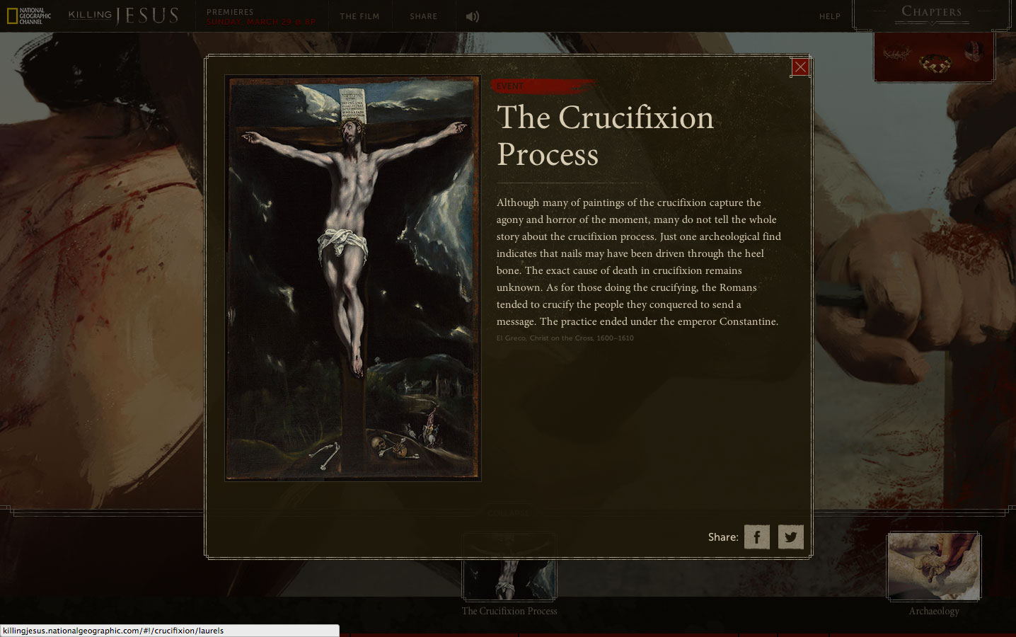
Vince Vaughn's fake stock photos for the movie Unfinished Business were hilarious because they were so cheesy. But they were Photoshopped from real stock photos—showing just how clichéd a lot of stock business imagery has been.

But it's evolving, says Getty Images, which did the Vaughn campaign with New Regency 20th Century Fox. And it's taking its cues more than ever from social media, as the visual language of photography evolves thanks to apps like Instagram, Snapchat and Pinterest.

AdFreak chatted with Rebecca Swift, director of creative planning at iStock by Getty Images, about the Vince Vaughn photos and why "perfection" is no longer everything when it comes to business images.

AdFreak: The Unfinished Business photos with Vince Vaughn were great. Where did you get the idea to make those?
Rebecca Swift: New Regency 20th Century Fox and Getty Images have worked together for years. The studios' digital marketing division pitched the concept and collection for the film Unfinished Business. The idea of working together to create a play on traditional corporate stock imagery with iStock by Getty Images, the biggest player in stock imagery, was born. The idea was to have a bit of fun—it's brilliant to see them all over social media, and how people are making them their own.

Why Photoshop old photos instead of shooting new ones?
The awkward Photoshopping was part of the fun! We wanted to create a series of photos that would be instantly recognizable—playing off all the classic stock tropes—an idea which feeds directly into the business storyline of the film. The best way to do this was by taking existing images from the Essentials collection on iStock by Getty Images and Photoshopping the actors' faces in, which creates this wonderful "double-take" effect—classic stock with a twist.

—Clichéd/perfect


—Authentic/imperfect


The original stock images that you used look cheesy to us today. I'm not sure how old they are, but clearly they're out of date, aren't they?
Classic stock images are familiar to us because we have seen the same scenario visualized thousands of times before. Clichés get ideas across, but it's just one style. IStock by Getty Images offers a wide range of imagery to suit the endlessly varied needs of our customers. Our Signature collection, for example, features realistic, more authentic looking stock images that a growing number of businesses are using to tell their stories and engage consumers.

Has social media taught us to feel differently about what makes a business image engaging?
People love pictures, and that's flooded into business communications. Audiences relate to brand imagery in the same way they do to their social media feeds. Social media—Instagram, Snapchat, Pinterest and others—certainly has made all areas of life more visual and public. At iStock by Getty Images, we've embraced this trajectory from the beginning. That's why we provide images taken from the "inside"—i.e., people who are in the moment—showcasing real emotions, real body language and a broader range of people. These increasingly popular images bring an authenticity that resonates with the viewer.

Older stock images were earnest and "perfect." There's a trend toward authenticity, reality and imperfection now, right? How do you strike the right balance there?
Older images traditionally were created by professional photographers skilled in the techniques of producing perfect imagery. At the same time, brands wanted images that reproduced well in print, often at large sizes.

In recent years, we have become accustomed to mobile photography that is imperfect and full of technical errors. We even add filters and lens flares to our images to make them less technically perfect.

The key trend is in visual storytelling—we forgive technical errors in favor of authentic storytelling. If a brand is keen to convey accessibility and familiarity—their "everyman credentials"—imagery that is relevant to a social media-viewing audience is effective. Imagery that reflects the aesthetics of user-generated content works. By way of contrast, if a brand wants to convey professionalism and expertise, more technically apt imagery would reflect this. Ultimately, achieving the right balance depends on your audience and your message.

—Clichéd/perfect


—Authentic/imperfect


How did the Lean In collection approach these kinds of issues?
The Getty Images Lean In collection was created to harness the power of pictures and our massive global customer base to overturn clichés and shift perceptions by promoting authentic images of women in media and advertising. The partnership celebrated its one-year anniversary last month, and one year on, we are seeing photos from the collection being licensed in over 65 countries, including Qatar, Kuwait and Korea, and sales doubling.

What else makes a good business stock photo, or any stock photo for that matter, these days?
Stock images are offered as a blank canvas for our customers to use along with other design elements to tell their own story. The more conceptual an image or the more compelling the story that can be attached to the image, the more successful it is.

Good business images are likewise great representations of the way we now do business. In an office, in the home, on the move, in a coffee shop, in a workshop—we relate best to the familiar and most engaging. We gravitate toward imagery that visualizes the way we personally do business and consequently are more sympathetic toward brands that use this imagery. If the people featured in the images around us are not dressed or styled as we expect, we reject them as tired and clichéd. If the photographic technique is one that has been overused by brands, we also find them tiring.

—Clichéd/perfect


—Authentic/imperfect

Ad of the Day: Ikea Praises Ordinary Household Items with Epic Irreverence

$
0
0

Don't take your toilet brush for granted, says a wise new ad from Ikea.

Aptly titled "Everyday Heroes," the spot—by Swedish agency Forsman & Bodenfors—is a moving celebration of the different household fixtures that improve lives, constantly, in myriad little ways, but still can't get any respect.

It perfectly nails the slow build from suspenseful to smirking to outright hilarious—peaking at the indignity of being a bathroom faucet on which totally rude people are always spitting their toothpaste.

In other words, the concept is brilliantly irreverent—funny because it's true (even if the idea of everyday heroes might be more generally associated with, say, firefighters). And if anyone's going to project human feelings onto a coat rack, or a lamp, it should probably be a furniture seller, and done this well.


Because these are the times we live in, the campaign also includes a Twitter feed, @EverydayHeroes365, narrated by and similarly devoted to honoring the usually unsung domestic workhorses.

It's currently occupied by Grundtal, a meta toilet paper holder that opened a comedy routine with a cute, innocuous 21st century nod to Descartes. But by its third tweet, it had rolled out a dubious one-liner blaming spicy #MexicanFood for making it dizzy. (Why any brand would ever attempt ethnic humor, especially about diarrhea, is not clear.)

Regardless, based on the campaign's overall theme, Ikea probably should have made it about the consumers around the world who nearly lose their minds while trying to assemble its products.

CREDITS
Client: Ikea
Agency: Forsman & Bodenfors
Title: Everyday Heroes
Art Director: Adam Ulvegärde
Copywriter: Joakim Labraaten
Designer: Martin Joelsson
Senior Account Director: Olle Victorin
Account Director: Katarina Klofsten, Maria Hallenborg
Agency Producer: Jens Odelbring
Digital Producer: Peter Gaudiano, Jimmy Wulff
Production Company: Anonymous Content
Director: Joachim Back
Executive producer: Eric Stern
Producer: Brian Quinlan
Director of Photography: Jan Velicky
Editor: Jeppe Bodskov


Carlsberg Makes the Most NFSW Ad Ever, Along With a Few Other Gems

$
0
0

Carlsberg doesn't do things half-ass. If the Danish brewer is going to do something, it will make it the best in the world—at least, according to three new ads admitting that might not actually be true at all.

The campaign, by 72andSunny in Amsterdam and the new Copenhagen office of New York's MacGuffin Films, imagines what would happen if Carlsberg made erotic dramas, sang karaoke or taught language courses. In each, it would excel—"probably," the ads say.


The campaign marks the return of the famous "If Carlsberg Did" theme after an absence of four years. "Carlsberg beer is made by natural, unique ingredients, and MacGuffin have helped us make these come to life in a refreshing and indulging way. Hereby, the beer itself is put on a pedestal, just where we think it should be. Probably," says Carlsberg director of strategy and innovation Didrik Fjeldstad.

See the other spots below.


CREDITS
Client: Carlsberg
Spot: "If Carlsberg Did"
Agency: 72andSunny, Amsterdam
Production Company: MacGuffin Films, New York
Director: Nick Fuglestad
Executive Producer: Sam Wool

NatGeo's Killing Jesus Website Might Be the Greatest Story Ever Scrolled

$
0
0

Mullen has created a digital experience of Biblical proportions to support National Geographic Channel's Killing Jesus, a three-hour docudrama premiering March 29, which is Palm Sunday. The show is based on the best-selling book of the same name.

An immensely detailed, immersive website tells the story from three different perspectives: Son of God (the view of Christ and his disciples); Son of Man (the view of the Jewish priests of the time); and Threat to Rome (taking in political/economic implications). Each perspective is represented by a different crown: thorns, religious headdress and Roman laurels. This technique provides users with a panoramic perspective of Jesus's life, allowing them to explore events from every conceivable angle.


"We were looking to tell the story in a way that allowed people to see it from several different vantage points," says Mullen associate creative director Allison Rude. "Our war room on this project resembled the wall from 'A Beautiful Mind' as we pieced together historical fact, religious scripture and custom illustrations."

French artist Bastien Lecouffe Deharme created the impressive artwork, and his hand-drawn contributions grace the site's eight self-contained chapters, which span Christ's story from his birth in a Bethlehem stable through the crucifixion at Calvary. The amount of interactive information and analysis is pretty staggering. Users could lose hours (days?) investigating the various timelines (from three perspectives, no less).

That said, the navigation is intuitive, and all aspects of the presentation (based on my 30-minute spin through the site) seem compelling.


The technical specs are suitable impressive. The site's scrollable panoramas contain more than 3,000 individual images, animated with 14,000 keyframes, along with 185 sound, music and voiceover tracks. All of this was made using 290,000 lines of code, which Mullen says is four times the size of its two previous NGC sites combined. Those sites supported the cable net's Killing Lincoln and Killing Kennedy programs.

But wait, there's more. Supplemental material includes a Killing Jesus microsite with articles, video clips, photo galleries, deleted scenes and cast Q&As, as well as an NGC blog campaign called "Killing With Kindness," inspired, we're told, by Christ's teachings on love and charity, and promoted on social media with the #KillingWithKindness hashtag.


Like Mullen's earlier NGC outings—and The Martin Agency's similar digital work for the JFK Library—this initiative's vast scale can seem overwhelming at times, especially for a story whose elements are so familiar. Still, the bold, multiview style—respectful, yet rigorously researched and probing—is fairly innovative, and might give users fresh insight.

Given the weighty nature of the subject matter, Killing Jesus's all-in approach feels appropriate, not like overkill.


CREDITS
Brand: National Geographic Channel
Client: Matt Zymet, Executive Director, Digital Media
Client: Ashley Kalena, Digital Media Producer
Agency: Mullen
Chief Creative Officer: Mark Wenneker
Executive Creative Directors: Tim Vaccarino, Dave Weist
Associate Creative Directors: Allison Rude, Brian Leech, Scott Slagsvol
Copywriter: Eugene Torres
Vice President, Executive Producer: Tiffany Stevens
Senior Digital Producers: Alyssa Hartigan, Kim Ryan
Group Account Director: Rebekah Pagis
Account Director: Jessica Zdenek
Assistant Account Executive: Stephanie Costa
Director of Development Operations: Steve Laham
Senior Quality Assurance Engineer: Ryan Nelsen
Senior Vice President, Creative Director, Technologist: Christian Madden
Senior Vice President, Director of Interactive: Mathey Ray
Associate Creative Director, Technologist: Joe Palasek
Senior Creative Technologist: Justin Bogan
Creative Technologists: Adam Riggs, Stefan Harris
Associate Quality Assurance Engineer: Amber Archambeault
Senior Production Designer: Terri Navarra
Senior Content Manager: Caroline Roberts
Motion Designer: Jeremiah True
Vice President, Digital Production Manager: Steve Haroutunian
Senior Creative Technologist: Costa Boudouvas
Senior Experience Designers: Charlene McBride, Krista Siniscarco
Junior Production Designer: Candice Latham
Senior Vice President, Director of Broadcast Production: Zeke Bowman
Animator: Eric Ko
Vice President, Director of Art Production: Tracy Maidment
Senior Art Producer: Jessica Manning
Vice President, Senior Video Editor: Jessica Phearsome
Senior Copywriter: Kelly McAuley
Assistant Editors: Libby Ryerson, Nick Brecken
Business Manager: Vanessa Fazio

Animation/Graphics
Artist: Bastien Lecouffe Deharme
Artist Representation: Shannon Associates

Music
Sound Design: Mike Secher

Audio Post
Sound Design, Mixer: Mike Secher

Clever Outdoor Ads List Cost of Their Own Square Footage If They Were Homes in England

$
0
0

Several hard-hitting outdoor campaigns have protested soaring home prices in the U.K. lately, including these bleak billboards narrated by people who've been priced out of London. Now, AMV BBDO has unleashed a clever campaign on behalf of Homes for Britain, which advocates pressuring politicians to help build homes people can afford.

The centerpiece is an outdoor campaign in the Westminster subway station. The ads call attention to their own square footage and calculate how much that amount of space would cost if it were part of a home in London, Edinburgh, Bath, York or Oxford.

In addition to wall posters, there are more intriguing placements, including ads on escalator steps (the area of a single step would cost £6,111 in central London) and inside train cars (a single car would cost £618,375 in Westminster and £302,182 on average in London).

Check out more ads below. Via The Inspiration Room.

Ad of the Day: Meet Charles Schwab's New Intelligent, Nonhuman Pitchman

$
0
0

Charles Schwab gets replaced by a robotic pitchman in Crispin Porter + Bogusky's new campaign introducing a digital platform called Schwab Intelligent Portfolios.

A stylized, British-accented, boxy digital monitor has the starring role. It floats in the air like some kind of finance drone, explaining its mission—"I am a fully automated investment advisory service. I can help you choose investments, monitor them and rebalance your portfolio"—in soothing, measured tones that make me believe it would really rather kill all humans! (Or at least mess with their credit scores, like these sadistic servers.)


I understand the client's desire to bring the technology to life, as it were, and give it a personality. But to me, the brokerage bot's calm demeanor and trippy futuristic environs bring to mind 2001: A Space Odyssey's murderous HAL 9000. I kept expecting the unit to purr, "Your income is shrinking, Dave," before belting out a few choruses of "Bicycle Built for Two."

In one of four 30-second spots breaking this week, the device—named "Blue," apparently—concedes that some customers might prefer dealing with a member of their own species. "You can always speak to someone at Schwab," it says. "They aren't algorithms. Try not to hold it against them."


Will consumers trust this machine? We asked a human at Charles Schwab: Jonathan Craig, the firm's CMO.

Why go in such an offbeat direction?
We believe that the launch of Schwab Intelligent Portfolios is a large, disruptive move that has the potential to fundamentally change how many Americans invest. We needed a breakthrough campaign idea that reflected the significance of the launch. The campaign is anchored by a blue square, designed to personify the technology with a simple iconic visual device. The square has a direct connection to the Schwab brand. It is a symbol for how consumers engage with technology today (experiencing everything online in icons and apps) and it helps us to tell the product story in a clever, sharp and witty way.

Do you think people might find it creepy?
We think Blue is anything but off-putting and did extensive research to validate the approach. He is clever—intelligent, even—and to the point.

Why make such a radical change and show a computer, especially when the brand is famous for using its namesake as pitchman?
We have used Chuck in our marketing multiple times over the last several years and will likely do so again. He is a huge asset that embodies the values of the firm more than anyone, and he has a unique ability to connect with clients and prospects. For the launch of Schwab Intelligent Portfolios, however, we wanted to take a unique approach that signaled the revolutionary nature of what we are offering.

What's the key message for consumers?
Millions of Americans are in need of investment advice but haven't found a good option. We want them to understand that Schwab Intelligent Portfolios is right for anyone looking for an easier, more accessible and affordable way to get investment advice.

We're expecting that this new campaign will reach a broader set of people who might in the past have tuned out marketing from financial services firms. In fact, we began extensive out-of-home advertising two weeks ago before launch—without any brand identification—to generate excitement and create buzz that would help us rise above our category.

CREDITS
Client: Charles Schwab
Agency: CP+B, Los Angeles
Executive Creative Director: Sue Anderson
Creative Directors: Hoj Jomehri, Krista Wicklund
Associate Creative Directos: Gary Du Toit, Antonio Mercato, Jimbo Emery, Nicholas Loftus
Copywriter: Eric Scott
Art Director: Daniel Koo
Executive Integrated Producer: Darryl Hagans
Production Company: Digital Domain
Mixing: Lime Studios
Audio Engineer: Samuel Casas
Audio Engineer Assistant: Kevin McAlpone
Music: Ring the Alarm
Head of Production: Jenny Hollowell
Creative Director: Darren Hollowell
Executive Vice President, Managing Director: Mason Reed
Vice President, Group Account Director: Ryan Skubic
Content Management Supervisors: Fiorella Juarez, Charissa Kinney, Laura Cunningham
Content Manager: Kara Bergman
Vice President, Business Affairs Manager: Rebecca Williams
Cognitive Anthropologists: David Measer, Steven Garcia
Traffic Managers: Kelton Wright, Cati Coscuella

Facebook Gets Even Friendlier With Striking Outdoor Ads and Mosaic of Digital Content

$
0
0

A few weeks ago, we posted Facebook's great new commercials about friendship, directed by Mike Mills. But there's a lot more where that came from—in various other media.

The "Friends" campaign also includes Facebook and Instagram ads, outdoor billboards, print ads and off-Facebook digital advertising to connect with people at different points in their day, both on and off the social network itself.


AdFreak's exclusive look at the billboards shows how striking they are—simple and very nicely art directed, with great snapshots of friends framed by the word itself, next to a check mark. A small Facebook icon is the only branding, again showing the brand's newfound confidence as an advertiser. (It's an iconic brand by now, and is finally acting like one.)

The digital experience is interesting, too. The site, friends.fb.co, including all sorts of clickable content—leading to quirky little videos and photos, all of which are sharable on Facebook with a click.


Facebook will also be on hand at SXSW Interactive this weekend, partnering with Turner Sports to broadcast the Selection Sunday celebration at Turner's live NCAA March Madness Bracket Lounge. The Facebook Live show will be streamed on the NCAA March Madness Facebook page at 6 p.m. CT on Sunday.

See more of the Facebook billboards below.

Whole Neighborhood Learns Sign Language to Surprise Deaf Resident in Samsung Ad

$
0
0

Samsung Turkey has launched a website with a video call center for the hearing impaired, and it's announced it with quite the stunt.

In the video below, titled "The Most Emotional Surprise of the Year," we follow Muharrem, a hearing-impaired man, through his morning routine. A month of preparation (including sign language training) and many cameras later, Muharrem goes through the city and is greeted by people who can communicate just like he does.


It ends with Muharrem approaching a large screen, with a woman signing to him "A world without barriers is our dream, as well." She announces the video call center for the hearing impaired, and then the "gotcha" moment happens.

Lot of tears. From Muharrem and maybe a viewer or two.

Take a Tour of Lego's Simpsons Kwik-E-Mart Set Before It's Unveiled at SXSW

$
0
0

One of the coolest branded buildings at SXSW this year will be particularly difficult to get into. That's because it's only 5 inches high, 14 inches wide and 10 inches deep. D'oh!

Having had great success with its first Simpsons construction set and minifigures, Lego will physically unveil its new Simpsons product at SXSW on Friday—the iconic Kwik-E-Mart featured regularly in the show.

The set goes on sale May 1. For hard-core fans of the Fox cartoon, it's a treasure trove. And it also has Easter eggs for Lego fans, including very rare dark orange bricks.


Among its more interesting features:

• Six minifigures: Homer Simpson, Bart Simpson, Marge Simpson, Apu Nahasapeemapetilon, Chief Wiggum and Snake (aka Jailbird)
• Opening rear walls, a removable roof with secret vegetable garden, Kwik-E-Mart signage, light-blue walls, dusty blue floors, turquoise welcome mat, shelves, refrigerated cases, counter, Buzz Cola soda fountain, juice dispensers, coffee machine, two arcade games, ATM, crates of Powersauce bars, surveillance cameras, rear storage closet with a rat, cheese, rat hole and an exit door
• Shelves featuring beauty products, diapers, dog food, pastries, fruits, vegetables and more—including Krusty-O's and Chef Lonelyheart's Soup for One
• Refrigerator cabinets with a variety of beverages including cans of Buzz Cola … and frozen Jasper
• Counter with a cash register, magazine and card display, lottery machine, hot dog oven, donut display and a Squishee dispenser with two Squishees
• Chief Wiggum's police car featuring an opening trunk, removable roof and space for three minifigures

Many more pics below.


Kevin Bacon Does Ads for Eggs, Because What Goes Better With Eggs Than Bacon?

$
0
0

Kevin Bacon has traded off the whole "six degrees" thing in ads for years. Now it's time to put the Bacon to work.

And that he does in an amusing if obvious campaign from Grey New York promoting eggs on behalf of the American Egg Board. Because after all, nobody knows eggs better than bacon. Or Bacon.

The online video gets surprisingly suggestive, as Kevin puts up with some heavy flirting from a married woman who discovers him just lying on her kitchen counter one morning. And the spot doesn't tire of puns, even though Kevin claims not to enjoy them.


He does enjoy his eggs, however.

"With a last name like Bacon, I'm the obvious choice, and I'm excited to be a part of the new Incredible Edible Egg campaign," Bacon says in a statement. "I like the creativity behind the idea, and I've always been a big fan of eggs. They're a nutritional powerhouse and I never get tired of them because there are so many ways you can eat them."

Per-capita egg consumption grew to 260 in 2014, an increase of more than a dozen over the last five years, according to the USDA. The celebrity ad campaign is designed to keep that momentum going.

"Kevin Bacon brings real star power to the world of eggs and we think consumers are going to love this clever new version of bacon and eggs," says Kevin Burkum, the American Egg Board's svp of marketing. "And there's no better time to talk about eggs with consumption at its highest level in three decades and Easter right around the corner."

See the print ad below.


CREDITS
Client: American Egg Board
Spot: "Side of Kevin"
Agency: Grey, New York
Chief Creative Officers: Tor Myhren (Global), Andreas Dahlqvist (New York)
Creative Directors: Ari Halper (Executive Creative Director), Steve Krauss (Executive Creative Director), Brad Mancuso, Susan LaScala Wood
Art Directors: Jay Hunt, Pete Gosselin, Matt DeCoste
Copywriters: Jay Hunt, Pete Gosselin
Agency Producer: Perry Kornblum
Production Company: Moxie Pictures
Director: Martin Granger
Director of Photography: Alar Kivilo
Editor: Alex Cohan @ Vision Post
Music, Sound Design: Matt Baker @ Vision Post
Principal Talent: Kevin Bacon, Geneva Carr, Jeff Wiens

It's Funny When Celebs Read Mean Tweets. Here's What Happens When Kids Read Them

$
0
0

"Celebrities Read Mean Tweets" is one of Jimmy Kimmel's most popular segments. It's been spoofed here and there—even by ad agencies. But now, Canadian agency John St. takes the theme in a bit of a different direction with "Kids Read Mean Tweets."

Check it out here:


"It's easy to laugh at rich celebrities reading some of the terrible things people have said about them online. We condone it. We even revel in it," the advertiser, Canadian Safe School Network, said in a statement. "But this same behavior is turning almost 40 percent of Canadian kids into victims of cyberbullying. It's a growing epidemic that invades their lives and leaves many feeling like there's no way out."

The client has even started an Indiegogo campaign to raise money, all of which will go into buying online video so the spot can be seen by more people.

CREDITS
Client: Canadian Safe School Network
Agency: John St, Canada
Executive Creative Directors: Stephen Jurisic, Angus Tucker
Creative Director: Niall Kelly
Copywriters: Kohl Forsberg, Jacob Greer
Art Directors: Jenny Luong, Denver Eastman
Agency Producers: Madison Papple, Cas Binnington
Account Supervisor: Matty Bendavid
Digital Strategy: Adam Ferraro, Michael Nurse
Community Manager: Jacqueline Parker
Production Company: OPC
Director: Chris Woods
Director of Photography: James Gardner
Executive Producers: Harland Weiss, Donovan Boden, Liz Dussault
Line Producer: Dwight Phipps
Editing: Saints Editorial
Editor: Mark Paiva
Editorial Executive Producer: Stephanie Hickman
Editorial Producer: Ardith Birchall
Visual Effects, Online, Finishing: The Vanity
Colorist: Andrew Exworth
Flame Artist: Naveen Srivastava
Visual Effects Executive Producer: Stephanie Pennington
Audio Post Facility: Eggplant Collective
Audio Director, Composer: Adam Damelin
Audio Head of Production: Nicola Treadgold

Adweek's Top 5 Commercials of the Week: March 6-13

$
0
0

It was a week of good versus evil, from everyday heroes to murderous drones. And we also had two spots about mysterious growths. Check out our picks for the week's best commercials below, and vote for your favorite.

Ad of the Day: Robert Downey Jr. Surprises a 7-Year-Old With a Bionic 'Iron Man' Arm

$
0
0

There are good ways to use your megafame, and bad ways to use your megafame. Robert Downey Jr. has happened upon one of the best ways to use his—by drawing attention to Limbitless, a company that makes 3D-printed prostheses, and the recipient of one, a 7-year-old named Alex who really likes superheroes.

With Downey to help out, Limbitless made Alex an Iron Man arm. And Iron Man himself gave it to him, as you can see in the video below. So, you know, get ready to ugly cry.


Limbitless is a part of Microsoft's large-scale charity operation The Collective Project, which is being used to market OneNote, a mildly boring cloud-based project management program Microsoft sells.

The point of the campaign, which is honestly just objectively good use of marketing dollars any way you slice it, is to demonstrate the kinds of thing you can get done with mildly boring project management software, like funding students in Collective Project to do things like build awesome robot arms for people with disabilities and help impoverished orphans (see below).

Both inspirational videos have a brief pitch for OneNote at the end. Sure, it's manipulative, but ad dollars seem to have gone to do genuinely good things, and that's great to see.

Also the tiny little Iron Man hand in the big grownup Iron Man hand.

Excuse me.

How to Make a Great Radio Ad, Now That You Know How to Make a Terrible One

$
0
0

The Radio Mercury Awards recently made a two-part video about "Things We Don't Want to Hear in a Radio Ad." In my writeup, I wanted to know what they do want to hear in a radio ad. And dear God, they actually listened to me. (This may be the most influence I've ever had over anything. I am hyperventilating and should probably lie down.)

While I go mad with power, you should watch unshaven Mercury chief judge Jim Elliott explain what makes a good radio ad. His answer? "Undeniable human truth." Kind of a tall order, but that just means good writing and sharp ideas that take advantage of the medium.


Thanks for the clarification, Jim! (That wasn't sarcastic, I really do appreciate it.) The video also lists the reasons people should try for an award this year. "Skrilla" and "hooch," presumably free, are among them.

And if you missed the "Things We Don't Want to Hear in a Radio Ad" videos, check them out below.


CREDITS
Client: Radio Advertising Bureau
On Camera: Jim Elliott
Director: Kevin R. Frech
Production Company: Logical Chaos
Editor: Nick Fehver

Viewing all 10179 articles
Browse latest View live


Latest Images