Quantcast
Channel: Adweek Feed
Viewing all 10197 articles
Browse latest View live

Gym Creates 'Fit Nesting Dolls' to Show How You'll Shrink as You Exercise More

$
0
0

Lots of people join a gym at the beginning of the year, then quit within a few months.

To keep customers coming back, CrossFit chain Brick and agency BBDO New York created a series of custom nesting dolls that illustrate the stages of progress that gymgoers will see if they stick with their fitness plans.

Different version of these "Fit Nesting Dolls" track to different kinds of fitness goals—lose weight, prep for a triathlon—with a computer flash drive containing a workout routine located at the center of each set. All get consecutively thinner without losing much height.

Various artists designed the iterations on the theme. The results are generally cute and diverse—though some of the largest dolls come off as comically unflattering, which also risks seeming mean-spirited.


Made with a 3-D printer and handed out to new signups at Brick, the dolls also served as the centerpiece of social advertising and on-site posters. Layouts showing the succession of dolls side by side offered the clearest and most compelling version of the work.

But most entertaining are the animations at the top of the promotional video above, wherein the dolls sprout arms and pump iron while making appropriately ridiculous faces.

Overall, the idea is clever. And images of nesting dolls with cut abs are also pretty funny, especially in contrast to the traditional, more conservatively clad Russian iteration.

Whether it communicates what Brick wishes it to might be a different question. Nobody wants to spend five months suffering at the gym to end up shaped like an oblong egg, no matter how ripped.


CREDITS

Client: Brick

Agency: BBDO New York
Chief Creative Officer, Worldwide: David Lubars
Chief Creative Officer, New York: Greg Hahn
Associate Creative Director/Art Director: Bianca Guimaraes
Senior Copywriter: Rodrigo Linhares
Senior Art Director: Florian Marquardt
Director of Integrated Production: David Rolfe
Executive Producer: Neely Lisk
Lead Integrated Producer: Courtney Fallow
Photographer: Billy Siegrist / Koji Yahagi
Physical Designer/3D Model: Jeian Jeong
Type Designer: Marcelo Righini

Digital Production Company: Visorama Diversões Eletrônicas
Account Manager: Samanta Martins
Stop Motion Artist: Luciano do Amaral
2D Digital Animator: José Bessa
3D Modeling Artist: Elisa Branco
Illustrators: Tiago Vaz, Felipe Blunt, Giorgi Popiashvili, Gustavo Teixeira, Henrique Sanchez, Isabela Andrade Lima, Juarez Rodrigues, Julia Quaresma, Lukas Doraciotto, Luke Bott, Marcel Yunes, Moyl Cledera, Paula Fernandes, Paula Isabelle Souza, Paulo Cesar Correia Lima, Sabine Hegmann, Sajid Wajid Shaikh, Rich Tu, Halil Mete


This McDonald's Billboard Near Whistler Gives Snow Reports via Espresso Drink Toppings

$
0
0

Cossette in Vancouver has made another tasty McDonald's billboard that skiers and snowboarders heading to Whistler will think is pretty gnar.

The ad uses real-time snowfall data to synchronize the whipped cream or foam levels on McDonald's espresso drinks to the amount of recent snowfall in centimeters at the Whistler Blackcomb resort.

The billboard is on Highway 99 in Squamish, B.C., en route to the mountain. It has been running for the full month of February.

Cossette did something somewhat similar last February with a digital billboard for the Egg McMuffin, showing the sandwich rising into view just like the sun in the morning.

Aubrey Plaza Quietly Fails to Save the Free World in This New iPhone Commercial

$
0
0

Apple released a couple of new iPhone 6 commercials on Wednesday, and mostly they're feature focused, though Aubrey Plaza does have a cameo in "Less Time"—a spot about the 3D Touch feature that saves you time by letting you "peek" and "pop" content in other apps without leaving the app you're in.


The Parks and Recreation actress is amusing as usual, and the spot has a little fun with her flight itinerary, which is the content she's concerned about within the conceit of the ad. The screen shots of her itinerary flickers by much too fast to see on TV, but that's why we have online screen captures.


Yes, it seems Plaza is a secret agent who has utterly failed in her mission to save the free world. But hey, nice 3D Touch feature. (This "Ken Orlino" who allegedly sent the email, by the way, appears to be an account exec at Apple agency TBWA\Media Arts Lab.)

Check out the second spot below, which shows off the "Live Photos" feature. 

If You've Ever Looked for a NYC Apartment, You'll Love These Brutally Wry Ads

$
0
0

Apartment hunting in New York City is a series of endless, gut-wrenching compromises. If you want this, you won't get that. If you must have that, you'll never get this. It's a math problem as much as anything, and StreetEasy captures it nicely in an illustrated campaign from new agency Office of Baby.

The NYC real-estate site's "Find Your Formula" ads show the kinds of dismal equations that will eventually lead you to housing in the astronomically priced town. And the ads are full of comically frank images—like toxic waste (Gowanus), rats and roaches (East Village), hedge-fund babies (Meatpacking) and third marriages (Upper East Side).

Click the images to enlarge.


Paul Caiozzo and Nathan Frank, creative partners at Office of Baby, brought StreetEasy with them from Goodby Silverstein & Partners New York after that office closed last summer.

"As longtime New Yorkers, we are intimately acquainted with the challenges that everybody faces when they look for an apartment in New York," Frank tells AdFreak. "Nobody gets what they dream of, but New York has a way of forcing you to understand what you really value. We wanted to capture the decision-making process we have personally gone through when you decide upon an apartment in NYC."

The work builds on the visual style of Caiozzo and Frank's 2015 campaign for the brand at GS&P, which was themed "Live as you please." And the funny, intricate illustrations are great for the subway, where people stare at the same image for an entire commute.

"We also wanted to carry over some of what we perceived to be the magic from our previous campaign," says Frank. "That is, the deeply detailed illustrations that people could spend time with and investigate further on their commute into the city. And the hard truths and sacrifices of NYC living."


CREDITS
Client: StreetEasy
Campaign: "What's Your Formula?"
Agency: Office of Baby
Creative Partner: Paul Caiozzo
Creative Partner: Nathan Frank
Art Director: Esai Ramirez
Copywriter: Steve Mcelligott, Jerome Marucci
Executive Producer: Anthony Nelson
Illustrator: Shy the Sun

Ad of the Day: Lawn Doctor Just Made a Ton of Quirky New Ads and Will See What Sticks

$
0
0

Ad agency Sleek Machine goes yard for Lawn Doctor, launching dozens of creative assets ahead of the spring sales season. 

Rather than focus on an overarching campaign with a unifying brand theme, the agency opted for a series of highly targeted social videos, banners and related content, addressing specific consumer concerns in fun and often unexpected ways. 

"This is retail advertising, first and foremost," Tim Cawley, Sleek Machine's creative chief, tells Adweek. "It seemed most important to motivate an immediate reaction, as opposed to creating some lofty strategy." 

All told, the campaign contains more than 50 ads that will run through mid-summer. Several different creative textures are on display, each boasting satisfyingly askew humor that never goes too far over the top. For example, to illustrate the mantra, "Don't be embarrassed by your lawn," several clips are set in a brown-ish, barren backyard, and feature a typical American family … wearing paper bags over their heads: 

Junior needs a bigger mitt. Hey, maybe The Unknown Comic can break into that lineup!

Next, we have minimalist spots that showcase luxuriant lawns. "Lots of brands do Happy Valentine's Day type posts, based around calendar holidays," says Cawley. "But we wanted something more ownable. What are those occasions over the course of the spring and summer when you friends, family and neighbors might be coming over, and you need to have your place looking up to snuff?"

Whoa, even clown feet are creepy. Take a hike, Bozo!

Now, for a complete change of pace, Eric Schwartz croons some sublimely silly numbers:

If Billy Joel were obsessed with lawn care, he'd write songs like that. "Eric was a recommendation from a producer friend in L.A,." says Cawley. "Those are complete, unedited takes. No vocal tuning, no computer tricks. He made up each of those melodies right on the spot."

The next video shows content seeded as unbranded social posts. The items pop up in user feeds with cutesy clickbait headlines, but clever twists await:

Adweek responsive video player used on /video.

Of course, no social campaign would be complete without cuddly pets. Here, Fido and Whiskers pitch in to tout the client's Yard Armour mosquito and tick control line:

The buy is concentrated on YouTube, Facebook and Scripps sites like DIYNetwork.com and HGTV.com. Placement turns on "a programmatic media plan powered by Lawn Doctor's first-party data set via MediaMath," says Cawley. "Every creative department wants to make lots of stuff. Every client loves to test, learn and optimize." By making so many pieces of creative, both Lawn Doctor and Sleek Machine can gauge what works best in the marketplace, he says.

Working quickly, however, was paramount late last year, during the campaign's production. In order to get lush, verdant backyard footage, "we shot all the work in a feverish 48-hour window," says Cawley, "just in the nick of time before America's lawns went dormant for the winter."

More work below.

CREDITS
Client: Lawn Doctor, Yard Armour
Agency: Sleek Machine, Boston
Chief Creative Officer, Writer: Tim Cawley
Senior Writer: Jeff Marois
Art Director, Additional Edit: Alan Duda
Senior Integrated Producer: Ben Ouellette
Editor: Dave Shaw
Director, Director of Photography: Sunny Zhao
Production Company: Dreams Factory
Talent, Composer (Yard Armour): Eric Schwartz
Music: Andy Pinkham, Mortal Music
Cinematography, Edit, Color Correct (Yard Armour): Nick Agri
Retouching (Yard Armour): Ivan Sokol, ArtStation
Media: Adam Cahill, Anagram (programmatic media)

If You're Sick and Tired of Hipstery 'Maker' Culture, Watch This Hilarious Video Now

$
0
0

Creatives everywhere fetishize maker culture and the glory of handmade creation. But the line between DIY authenticity and insufferable hipsterism is a thin one, and Internet videos celebrating maker culture—they're everywhere—can be an absolute horror to sit through.

Except for this one.

It offers us a snapshot of one of the purest makers ever—a real artist at his craft. You'll never look at artisanal creation, or perhaps breakfast, the same way again. Fun video by freelance copywriter Andy Corbett and director/photographer/editor Patrick Kehoe.

Honda Turns Kids' Cute Stories Into Ads Styled Like Little School Plays

$
0
0

Honda is the latest marketer to let kids help write its commercials. And the strategy is, as usual, a solid one.

A pair of minute-long videos from RPA introduce "Storytime with Accord," a campaign based on the imaginings of children. The automaker and its agency prompted kids to draw pictures, describe their drawings, sit in the driver's seat of the car and then riff on the combined themes.

One of the resulting stories, from a 4-year-old named Ethan, features a pair of dinosaur pals—who eat pizza, naturally—in a Honda rocket on a road trip to Mars, where they do battle with a dragon to save a princess.


The other, from a 6-year-old named Kingsley, features a dolphin and a woman in a Honda submarine on an underwater treasure hunt—dodging a great white shark thanks to the car's force field (aka, headlights).


Overall, it's a familiar strategy. Back in 2012, Sony, McCann and Wes Anderson built a gorgeous animation about the inner workings of a smartphone based on an interview with an 8-year-old. AT&T and BBDO relied on the ad-libbed genius of a roundtable of kids to churn out some of 2013's best ads. Last summer, S7 Airlines and Wieden + Kennedy Amsterdam picked up a Silver Lion at Cannes for deftly turning kids' fantastical travel destinations into metaphors for actual places.

Honda and RPA's tack is fresh, insofar as they created their commercials in the style of elementary school plays, and it does fit with the marketer's "Power of Dreams" positioning, which includes one recent ad explicitly themed around child's play, and another that might as well be.

The new clips, for their part, also succeed at capturing the sort of irresistible free-wheeling randomness that's beyond the reach of adults who've been ground down into jaded versions of themselves by forces like reality—it's the kind of innocent, unencumbered charm that lies at the heart of kid-conceived storytelling.

Honda's results, with classic (or maybe even regressive) fairy-tale tropes like a pink-clad damsel in distress, feel a touch middle-of-the-road, even for an approach that's intrinsically lowbrow (to hate a kid's imagination would be like hating puppies and rainbows—perhaps valid, but not a popular position).

While purportedly unscripted, they also feel somewhat forced when compared to others in the genre, with no shortage of product shots and features woven, however slickly, into the playful scenes.

Still, they include enough in the way of little gems to hang together and be rewarding. It's a nice surprise, for example, that in Kingsley's mind, the hidden loot includes cake (all treasure chests should, if they haven't been sitting at the bottom of the ocean too long).

At some point, ad creatives should probably start doing their jobs, though, instead of leaving the heavy lifting to people under age 10. It's feeling more and more like a gimmick that should be put down for nap time.

CREDITS
Client: Honda

Agency: RPA
EVP, Chief Creative Officer: Joe Baratelli
SVP, Executive Creative Director: Jason Sperling
VP, Creative Director: Social Media: J Barbush
Sr. Art Director: Evan Boswell
Copywriter: David Bassine
Jr. Art Director: Enrique Alvarado
SVP, Chief Production Officer: Gary Paticoff
VP, Executive Producer: Isadora Chesler
VP, Director of Digital Production: Dave Brezinski
Executive Digital Producer: Linda Kim
Sr. Digital Producer: Annie Hough

VP, Associate Director, Digital Marketing: Aaron Dodez
Supervisor, Digital Content Strategy: Mike Dossett
Sr. Specialist, Digital Content Strategy: Tyler Sweeney
Coordinator, Digital Content Strategy: Amanda Womack

EVP, Management Account Director: Brett Bender
VP, Group Account Director: Adam Blankenship
Account Supervisor: Renee Egizi-Finger
Account Executive: Kaelin McGill

Production Company: Bö's House of Visual Arts
VP, Director, Content Production: Mark Tripp
Director of Photography: Simon Thirlaway
Producer: Sparky Pomeroy
Art Director: Mark Behn
Post Producer: Eddie Granado
Editor: Alex Jones
Editor: A'sia Horne
Score & Sound Design: Adam Deibert
Visual Effects: Eddie Granado

Record & Premix: Margarita Mix
Mix: Paul Hurtubise
GM: Michele Millard

Final Mix: Lime
Mixer: Dave Wagg
Assistant Mixer: Adam Primack

Color Correction: The Mill
Colorist: Adam Scott
Executive Producer: Thatcher Peterson

Chloë Sevigny, Alec Baldwin Turn Back Into Kids in Kiehl's Anti-Aging Zoolander Ads

$
0
0

Imagine an anti-aging cream so good it turns grown-ups back into children.

Last week, Kiehl's and Paramount teamed up to promote Zoolander 2 ahead of its Feb. 12 launch with a real-life "Derek Zoolander Center for People Who Don't Age Good." A play on the first movie's "Derek Zoolander's Center for Kids Who Can't Read Good," the experiential stunt—temporarily set up in New York's West Village—offered visitors a ridiculous tutorial at the hands of (naturally) male models.

But marketing shop Night Agency also hyped the event with five videos featuring celebrities reading voiceovers about the benefits of the center's program—while on screen, children lip-sync the monologues as young-again versions of the weathered old stars.


The personality selections are all smart. Alec Baldwin's whiskey voice, dripping with an apparently natural disdain for existence, makes for a perfect juxtaposition with a cherub-faced blonde boy. A tweenish stand-in for perennial '90s it-girl Chloë Sevigny ridiculously whines about suffering from a serious illness (getting old).

By the time a de-aged Martha Stewart appears on screen with a yellow knit sweater wrapped around her shoulders, over a white blouse and pearl necklace, it's impossible to keep a straight face. (Her youthful self looks looks unnervingly like Macaulay Culkin, while spouting absurd culinary references.)

They're all built largely around the same deadpan gag of little kids talking like over-the-hill adults. But each one manages to introduce something a little different. Kiehl's gets extra points for a particularly counterintuitive pick—swimsuit model Hannah Davis. Red-carpet personality Giuliana Rancic, for her part, breaks character and goes on a charming tirade (complete with a left-field Honey, I Shrunk the Kids reference).

In other words, they're well written and packed with jokes, while some deliberately awkward framing—random close-ups of faces, presumably to prove the effects of the center's beauty regimen—heightens the stupidity. Then there's the brilliantly idiotic tagline: "This message was messaged to you by the Derek Zoolander Center for People Who Don't Age Good."

The concept is the perfect mashup between Kiehl's interest and the studio's. (Their co-marketing efforts also included a pair of special product sets: "The Ridiculously Youthful Collection" and, because someone couldn't resist it, "Blue Kiehl's.") Alas, the campaign might be better than the movie itself, if the reviews are any indication. The general consensus seems to be that the Zoolander concept didn't age so good.

CREDITS
Client: Kiehl's
Agency: Night Agency
Editorial: Lost Planet


Why These Museum Ads With Will Ferrell Make Me Really, Really Mad

$
0
0

The La Brea Tar Pits and Museum commissioned a campaign from creative agency Imaginary Forces to celebrate its renovation. They somehow got Will Ferrell to help them out, and from there, it's pretty clear they didn't know what to do. They got access to one of the funniest men in America, someone who could have catapulted their campaign to instant Internet hilarity and stardom. And they wasted him. 

In the series of what will eventually be nine videos, Ferrell takes questions from kids and ad libs funny answers. It should be funny. It should be great. There's even some great lines and a few great shots of kids giving Ferrell sassy eyes. But the production, lack of editing and even the constant drone of the freeway left in there by the (possibly non-existent) sound editor just kills it.


I mean, if you're going to get what I assume was free talent at the caliber of Will Ferrell to help out your nonprofit, please do the responsible thing and pay for some top-level production and editing. Or go the opposite route! Make it so bottom-barrel badly produced and horribly train-wreck-tastic that we can't look away and we all have to share it.

There's no excuse for stale jokes and mediocrity that could have been so much better with an editor with better timing or, maybe I dunno, multiple takes? Maybe let Will go on for like 10 minutes until he devolves into absurdity and cut down to the best bits? As a copywriter, I would kill, metaphorically, to have a half-hour of Will Ferrell ad-libbing. Whoever made this had that, along with a gaggle of kids—who are naturally hilarious by the way—and somehow … it falls flat.

They also got artists Gary Baseman and Mark Bradford and science communicator Cara Santa Maria to join the campaign, and they also filmed some mediocre videos of them with horrendous sound. But let's focus back on Will Ferrell. It just makes me so rage-filled.

They've got a lot more celebs committed to the campaign: Laura and Kate Mulleavy of RODARTE, artist Catherine Opie, author D.J. Waldie, landscape architect Mia Lehrer, Los Angeles County Supervisor Mark Ridley-Thomas and KCRW DJ Anthony Valadez. And all of them are going to talk about how much they love the tar pits. Please, for the love of all that is advertising, produce the rest of them right.

And would it kill you to hire a sound guy?

Spike Lee and His Agency Just Made This Film About Brooklyn the Brand

$
0
0

Maybe it was the 2014 Wall Street Journal article about how Parisians refer to everything from men's hats to Big Macs as "très Brooklyn." It could have been the subsequent New York Times trend piece about a Dubai-based clothing company that chose to name itself Brooklyn Cotton Company in the interest of authenticity. Perhaps it was the CNBC piece that attributed "a rare form of capitalist magic" to the very word Brooklyn. 

At any rate, one thing is clear: New York City's most populous borough is now an international brand ... and a very valuable one at that. 

No man has more effectively served as an unofficial spokesperson for the city within a city than director Spike Lee. And so, his ad agency, Spike DDB, which is based in Brooklyn's Dumbo neighborhood, was the perfect shop to work on a project summarizing lessons marketers can draw from the city's rise. 

Brooklyn Made is an effort by the borough's Chamber of Commerce to certify goods produced in the area, and Spike DDB collaborated with the group on the 10-minute film. 


AdFreak spoke to Victor Paredes, managing director of Spike DDB, about how the project came together and what marketers and entrepreneurs can learn from it.

AdFreak: How did this project come about?
Victor Paredes: I recently attended an [Association of National Advertisers] conference, and the exit survey asked what sort of content we could see ourselves creating in the future. This came at a time when we [at Spike DDB] were considering how everything we see happening in Brooklyn is central to our agency's DNA, just like our connection to DDB. When you have a name that's being co-opted by brands wanting to call themselves "Brooklyn," from Tokyo to Dubai ... Brooklyn is a brand in a real way. If we were to explore the development of that brand, what could marketing at large learn?

What role did Spike himself play in developing the work?
As CEO of our company, Spike was intimately involved in our conversations about what we were designing and the types of businesses we wanted to speak to; he also participated in the film. Spike was also instrumental in reinforcing the ideas of cultural competence and the importance of community.

What do you mean by "cultural competence"?
Brooklyn has been incredibly diverse for decades, if not centuries. It has constantly been home to an influx of different immigrant groups and religous groups, all of whom learned to live alongside one another while also maintaining their identities. In Brooklyn, you can see something as interesting as an African American man walking into a Chinese fast-food place to order tostones ... and getting the order right!

Sometimes when marketing tries to address matters of diversity, we do so by overall vitrue of inclusion. But that's only surface-level; the future is about seeing things through different lenses in the interest of greater connectivity and innovation.

The press release also mentioned "growing with a community versus selling to a community." Is that an elaboration on the same theme? 
When speaking to the people at Brooklyn Brewery, we learned how they maintained their image while reaching the quintessential scale we all talk about in marketing. They developed their brand with a focus on respect for their community and the space they were occupying. Brewing has a rich history in Brooklyn prior to Prohibition, and they used these legacy processes to develop what became Brooklyn Brewery. 

When we asked them about expanding internationally, they spoke about how they don't just show up and say Brooklyn has arrived ... they learn and understand where they can contribute. This led them to open another brewery in Stockholm as they grow into an increasingly global brand.

How closely is Brooklyn tied to the spirit of Spike DDB?
About eight years ago, Spike decided that the headquarters of the agency should be Brooklyn, because it's near and dear to him. We developed a sense of home in the borough, and we get to see it day in and day out, at work and with our friends. When we have agency events, Spike often takes us to Junior's off the Flatbush Extension. 

With this film, we found an opportunity to tell a story to our industry, and it's educational for brands to see this: Be clear, focused and concise if you want to build your brand in a real way. From there, positioning and other claims will quickly follow.

In the video, Peter Shapiro of Brooklyn Bowl mentions a potential backlash for brands trying to jump on the Brooklyn bandwagon. What's your take? 
When brands are really good at what they do, others will want to co-opt that or somehow rub up against it. ... People will get themselves into trouble if they start to overuse the Brooklyn name when there's nothing behind it, as opposed to creating things of lasting value.

How did you collaborate with the Brooklyn Chamber of Commerce on this project?
They have also been paying attention to this [co-opting] trend as it's a bit of a threat to local businesses, so they designed the "Brooklyn Made" certification process. We exposed them to the idea, they helped connect us to area businesses, and we interviewed them for research purposes while maintaining creative and content control over the piece.

What are your ultimate goals with Brooklyn Made?
Our primary motivation was to bring thought leadership to the industry on matters of brand building. Moving forward, we are working with the Chamber to host a roundtable and a "viewing" with many area businesses, including the ones that participated in the film, in order to further that discussion.

We also do our part to live by the creed ourselves. We want to be real members of the community, learn from it and contribute back to it.

Ad of the Day: This Awesome Billboard Lets Tired Drivers Enjoy the Comforts of Home

$
0
0

We've seen lots of billboards over the years that want to provide some kind of utility, beyond just being a blight on the landscape. Here's the latest example from Peru—a billboard (and accompanying structure) from a home-improvement store that brings the comforts of home to weary drivers who could use a rest.

One in every three road accidents is due to driver fatigue, says the advertiser, Sodimac Homecenter. Many of these accidents happen on the Panamericana Sur Highway, which goes from Lima to the Chilean border and includes a long stretch of nothing but billboards and unscenic flatlands.

So, Sodimac and McCann Lima created a board that functions as a rest stop—where drivers can park for free and nap in a sheltered, single-car garage decorated like a bedroom, with 24/7 security and amenities including a Wi-Fi connection and sleep masks.

The client describes the ad as one that "doesn't just sell you something for your house, but delivers the restful comforts of home when you need it the most."


Adweek spoke to McCann Lima creative Alvaro Soto about the work. "During summer, people leave work on Friday and take the road at night," he says. "In order to make the most out of a weekend at the beach, some of them drive even when extremely tired, and that's when accidents happen."

A second insight was based on the Peruvian advertising market itself. "Every summer there is a fierce dispute among advertisers to get a spot along the highway, making it sort of a  Peruvian Super Bowl ad battle," Soto says. "Sodimac Homecenter is a home improvement store, which firmly believes in its concept: 'Do more.' Inspired by it, we thought, 'Why don't we transform our classic billboard on a place to sleep … so that drowsy drivers have a place to rest as they do at home, and so, prevent these highway accidents? That's how we 'Did more' with our billboard."

Drivers are allowed to rest as much as they need. "In fact, no one stays long hours because they are on their way to somewhere, so we are talking about short stays on average," Soto says. "There is no long waiting line, but there are people who stop by with their families or friends to take pictures, making the billboard a must-see along the way."

CREDITS
Client: Sodimac Homecenter
Agency: McCann Lima
CCO: Mauricio Fernández Maldonado/ Nicolás Romanó/ Christian Caldwell
Creative Directors: Jomi Rivera / Erick Galván
Copywriters: Alvaro Soto
Art Director: Kevin Contreras
Graphic Designer: Luis Veliz
CEO: Max Gutierrez
Account VP: Andrea Roselló
Account Director: Mirjana Slavkovic
Account Executive: Daphne Kizner
Account Assistant: Sandra Velasquez
Strategic Planner: Alessandra Noceda
Production: Carla Dextre
Production House: Saturno
Post Production House: Highend
Audio House: Audiosuite
Media Agency: Starcom
Billboard Implementation: Petty

Asics Gets Down and Dirty, and Very Sweaty, in 180's 'Want It More' Campaign

$
0
0

Hey, athletes and gym rats, do you WANT IT MORE? If so, Asics has the perfect ad campaign for you.

In this new global push from 180 Amsterdam and Smuggler director Henry Alex Rubin, the brand gets extremely tough and sweaty. "Want it more" is the tagline. Fit, perspiring, millennial bodies—shown going for the burn in weight rooms, sparring in boxing rings, twisted up on yoga mats and running in the wee hours—are the prime visual elements.

The voiceover is gruff and gravelly. Like Liam Neeson, but less kill-y. Still, dude's got an accent, and he's pretty darn intense. "This is an open letter to anyone who wants to be an athlete. If you want it more than sleep, if you want it more than all-night parties, if you want it more than likes, if you want it more than perfect hair, or cake … if you really want to be an athlete, just wanting it isn't enough."

He stops there, perhaps too exhausted to finish his thought. "Want it more" flashes on screen, so we're not left hanging. (Also, exactly what kind of "cake" are we talking about here? Is it especially yummy?)


"Getting better in sports is all about choices," 180 executive creative director Dave Canning tells AdFreak. "Whether you choose to go work out on a night that you normally would go party, or choose fitness over vanity, we want people to relate to these choices."

Of course, the campaign exemplifies the "tough-fitness" marketing approach so popular of late among athletic footwear and apparel companies. In fact, "Want it more" recalls Reebok's "Be more human" ads from last year. Both campaigns share a love of sweat and focus on personal sacrifice and denial. The Asics work is, however, less philosophical, more streamlined and direct. (Exercise won't necessary make you more human, but your pecs will sure pop!)

"A lot of other brands have gone after the tough athlete, but we wanted to go a little broader than that," says Dan Treichel, also an ecd at 180. "If you want to get better, whoever you are, then Asics will help get you there."

All in all, the tone should appeal to the bleary-eyed bodybuilders doing curls and crunches at 5 a.m. to stay ripped and ready for their weekend mud-runs and whatnot.

As for everyone else … let them eat cake! (Sorry, Asics, we want it more.)

CREDITS
Client: Asics
Senior General Manager, Global Brand Marketing: Paul Miles
Global Advertising Manager: Eva Sutter
Agency: 180 Amsterdam
Executive Creative Dir: Dan Treichel, Dave Canning
Art Director: Tony Bartolucci
Copywriter: Joe Craig
Executive Producer: 
Producer: Bethany Papenbrock
Asst. Producer: Davide Janssen
Account : Jim O'Regan
Business Affairs: Akvilina Jaskunaite
Planner: Ben Armistead
Production Co.: Smuggler/Gatehouse
Director: Henry Alex Rubin
DP: Ken Seng
Producer: Ben Link
Executive Producer: Chris Barett
Editorial Co.: Marshall Street Editors
Editor: Spencer Ferst
Producer: SJ O'Mara
Assistant Editor: Jake Armstrong
Online Facility: MPC Amsterdam
Colorist: Jean Clemant

Pepsi Is About to Unleash Emojis on Its Bottles and Cans Globally This Summer

$
0
0

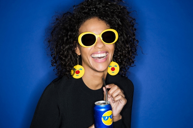
Coca-Cola famously did its names on bottles. Now, it's Pepsi's turn to execute a big, fun packaging idea—with a "PepsiMoji" campaign set to launch in 100 markets around the world this summer, featuring emojis on bottles and cans. 

A Pepsi rep confirmed the "Say It with Pepsi" campaign to Adweek, and said the emojis will be featured on packaging across the brand's portfolio of drinks—regular, MAX and diet/light.


The PepsiCo Design & Innovation Center created hundreds of PepsiMoji designs, to be used both globally and tailored for local markets. The PepsiMojis first appeared last summer in Canada, which did a summer and holiday program around them. They have also rolled out to other markets including Russia, Thailand and Pakistan, with more to come soon. They will reach the U.S. in the summer.

All of the designs use Pepsi's circle globe shape and the colors of blue, red and white, creating a universal language system proprietary to the brand.

The campaign extends beyond packaging. Other efforts in 2016 will include a fashion collaboration with Jeremy Scott with a global football program and PepsiCo partnership with UEFA.


Pepsi's other experiments with emojis in 2015 included launching the global Pepsi Challenge campaign with emoji art; celebrating World Emoji Day with a digital short film (see above); and launching a PepsiMoji Keyboard.

See some of the 2015 Canadian campaign materials below. 

BBDO Art Director Tells Us All About Snickers' Absurdly Photoshopped Swimsuit Model

$
0
0

BBDO New York has a big hit with its Snickers print ad—placed on the back cover of Sports Illustrated's Swimsuit Issue—that shows a swimsuit model comically and disastrously Photoshopped by an apparently hungry retoucher.

AdFreak caught up with agency senior art director Florian Marquardt, who says he's thrilled that people are loving the "Photo retouchers get confused when they're hungry ad," as well as a second execution (which ran on the inside back cover) with another model getting buffeted by a hungry wind-machine operator.

"First of all, we are very happy to see how many people, not just from the industry, responded really well to both ads and shared them on their social media and blogs," Marquardt says.

The challenge of the assignment, he says, was to extend the now 6-year-old "You're not you when you're hungry" story to the swimsuit issue "in a new and surprising way."

"On the Retoucher ad, we were aiming to compile at least two handfuls of non-conventional retouch errors in a single photo without making the changes appear immediately silly at first glance. I admit, on a second look they kind of do. On purpose, of course," he says. "My personal favorites are the 'ghost hand' and the 'partly missing leg' mistakes."

Marquardt credits photographer Vincent Dixon and retoucher Philippe Lepaulard with realizing the concept perfectly, and Snickers for greenlighting it.

"Snickers was a really great partner in this," he says, "allowing us to raise the bar and create something that people would engage and interact with. It is amazing to see that print advertising still isn't dead."

See both full ads below. Click to enlarge. 

Facebook Made an Amazing Deck of Playing Cards With Marketing Insights for Agencies

$
0
0

Facebook combined a playful concept with great design in this recent initiative to send its 2015 marketing insights to agencies—via a beautiful deck of 52 illustrated playing cards.

The deck was made by London creative agency Human After All. Each card offered a unique and engaging insight about Facebook and its U.K. users—from Santa to Star Wars, from Jay Z to Jon Snow—the agency says.

The packaging was personalized to the agency that would be getting each pack. And in addition to the U.K., country-specific packs were created for France, Italy and Spain with alternative insights and illustrations.

In all, more than 1,000 decks were distributed to agencies that work with Facebook. Human After All also created a large poster of the cards for Facebook to display in its headquarters and send to clients.

More images below. Click to enlarge. Via Creative Bloq.


Is The Met's New Logo as Indisputably Wretched as Everyone Is Saying?

$
0
0

The Metropolitan Museum of Art has done away with the beautiful da Vinci-inspired logo it's used since 1971 in favor of ... a double-stacked word mark made in kerning hell.

Vulture calls the update a "typographic bus crash," noting that "the whole ensemble looks like a red double-decker bus that has stopped short, shoving the passengers into each other's backs. Worse, the entire top half of the new logo consists of the word 'the.'" 

Other commentators are referring to it as "Times New Rotten." Justin Davidson, the architecture critic for New York magazine, labeled it a "graphic misfire." And GQ—with its trained eye for the female rear—observed that there are two bikini-clad butts hiding in the negative space of the E's.

The new logo was created by London-based Wolff Olins. The Met defended the design in a statement: "It is an original drawing, a hybrid that combines and connects serif and sans serif, classical and modern letterforms. In this respect, it reflects the scope of the Museum's collection and the connections that exist within it." 

The statement went on: "There may be debate about the logo because it involves change, but the museum chose it because it represents something simple, bold, and indisputable: The Met is here for everyone." 

If everyone hated good kerning, we'd buy that.

Let's look at the old logo, drawn from a piece in the Met's own collection—a woodcut by Fra Luca Pacioli, the guy who taught math to Leonardo da Vinci. We don't think it's particularly noninclusive:

And let's examine that new, letter-killing, article-elevating, butt-filled logo again: 


As an additional response to the backlash, the Met released marketing collateral that shows how the logo will look in action:


Ugh. Tell us what you think in the comments.

BBDO Cleverly Engineers a Mosquito-Repellent Motorcycle Exhaust Pipe

$
0
0

Think of it as a citronella candle on wheels.

Mosquito-borne illnesses are a growing issue in Thailand's slums, with the incidence of dengue fever tripling in 2015. To battle the glut of diseased pests, a Thai charity, the Duang Prateep Foundation, and its agency, BBDO Bangkok, repurposed another abundant local feature—motorcycle exhaust fumes.

The result is Moto Repellent, an anti-bug filter that riders—ubiquitous in Thailand—can attach to their tailpipes. The filter contains mosquito repellent oil that, when mixed with the heat from the engine's spent fuel, produces a special smoke that can deter mosquitos for up to three meters. 


The case study video for the pilot run includes a few dubious moments, like when a local community leader praises the solution's non-toxic nature. (The bike still looks to be pumping carbon into the atmosphere—whether the filter reduces its adverse impact on air quality isn't clear.) Some of the anecdotal testimony on its overall effectiveness also feels a bit stiff, and therefore staged.

In fact, the tool is one of those things that seems like it shouldn't work, even if it does. Regardless—or perhaps because of that—it makes for a crafty bit of problem-solving. Duang Prateep hopes to expand distribution with government funding. (It also might want to consider selling a bunch to Brazil.)

CREDITS
Client: Duang Prateep Foundation
Agency: BBDO Bangkok
Chief Creative Officer: Suthisak Sucharittanonta
Executive Creative Director: Chalit Manuyakorn
Creative Group Head: Peter Oh
Art Director: Sithum Walter
Copywriter: Chalit Manuyakorn, Peter Oh
Designer: Sangvian Suwan
Producer: Jirapan Vasanabunsongserm, YadaBuachan, Yathip Thanitthanaphat
Client Service: Wachira Ampornpachra
Production House: Meour Production Co., Ltd
Director: Kasemparn Jujindalert
Asst. Director: Teewin Varapaskul

Buckle Up, Because Delta Is Coming for You With Another Intense and Lofty Ad

$
0
0

Edgy airline commercials. Who wouldn't want more of those?

"Tell the World," the latest excursion in Delta Airlines' "Keep Climbing" campaign from Wieden + Kennedy New York, delivers an intriguing but turbulent ride. 

Last September, the carrier's "Take Off" spot, which focused on a single plane's departure as it sped down a runway, accompanied by narration from Donald Sutherland, veered into territory that was poetic, and a bit unsettling. The flight path now continues even further in that direction. 

As in last year's commercial, Smuggler director Adam Berg bypasses soaring planes with sunlight glinting off their wings, and smiley flight staff ... in favor of less predictable fare. Here, the emphasis is on destinations, as opposed to the journey. We see lovers embrace in a storm, a skier on a mountaintop, and some folks on a boat observing sharks.


Though riveting in their way, these dramatic, brooding visuals seem strangely ominous, especially in context. Are we flying into bad weather? Toward those icy peaks? Does that shark look hungry to you? 

This effect is heightened by the persistent whine of a jet engine and Sutherland's intense, breathy voiceover: "Once you get out here, that's all there is. There's just one direction: Forward. One time: Now. And there's just one sound: You and us, together, with a mighty roar, that tells the world we're coming for you." 

Such elevated language is clearly intended to sound spirited and adventurous, but the word choices could easily be construed as negative. That's all there is? Delta's coming for us?! It's easy to imagine Sutherland as a grizzled gremlin, delivering lines while perched on the wing and waiting to feed upon stray limbs ... especially after The Hunger Games. (I'm kidding. Sort of.) 

"The thought behind this spot was, how can you take everything you know about an airline commercial and move it from where you typically are into a much more emotional space—something that viscerally really stopped you in your tracks?" explains W+K New York executive creative director Karl Lieberman in a behind-the-scenes clip.

While it's admirable to aim high and steer clear of category clichés, Delta might consider a more grounded approach. We're starting to miss sun-kissed flight footage and those smiling stewards, always so reassuring and eager to please. (Take those nice people on British Airways, for example.)

Ad of the Day: 6 Emerging Talents Predict Their Future in Twitter's First @Video Series

$
0
0

Six content creators in music, art, sports, food and news—many of whom made their names on other platforms—have lined up to promote Twitter's native video platform, and its @video handle, with short self-promotional videos in which they predict the year ahead for themselves and their work.

It's an interesting mix of talent: singer-songwriter @ShamirBailey, foodie @ImLauraMiller, DJ superstar @MartinGarrix, NBA-star impersonator @BdotAdot5, journalist @AnaKasparian and renowned visual artist @JRart. Each of them filmed videos—between one and two minutes long, and created by Los Angeles agency Standard Time—in which they talk about their upcoming work, how Twitter helps enable it, and how video is key to connecting with their fans.

Check out the videos here:

None of the six can truly claim to have launched a career through Twitter, much less Twitter video, though several of them do have large Twitter followings. (@BdotAdot5's famous Russell Westbrook impersonation hit Twitter before YouTube last summer, but he has five times as many Instagram followers as Twitter followers. Likewise, Garrix has 2.4 million followers on Twitter—but just as many subscribers on YouTube, where he's enjoyed 244 million video views.)

This is mostly because Twitter's native video platform is newer, of course—barely a year old—and so the company doesn't yet have a deep roster of native video talent like YouTube, or even Instagram. But Twitter is clearly investing in native video.

Users can now film and upload videos directly from Twitter with its mobile video camera; view clips in their timeline with autoplay; send videos to friends privately through Direct Messages; and watch a curated set of videos daily through Twitter's own @video account.

As with any project that users influencers, the focus is split here between promoting Twitter and promoting the personalities themselves. If anything, the #FFWD2016 series maybe goes a little light on the Twitter branding.

But that's probably wise. People care about the content, not the platform—and for a first pass at a video series, #FFWD2016 acquits itself well.

CREDITS
Client: Twitter
Agency: Standard Time

Ad of the Day: JetBlue Asks Flyers to 'Reach Across the Aisle' in Election-Year Stunt

$
0
0

JetBlue invited 150 unsuspecting passengers to "Reach Across the Aisle" in this fun, election-themed stunt from longtime partner MullenLowe.

Those travelers were given the chance to win free round-trip airfare to one of 20 domestic or international destinations served by the carrier. But … they'd get those travel certificates (worth about $300 each) only if they could decide on a single destination by unanimous vote before their six-hour flight from Boston landed in Phoenix.

"JetBlue is one of those brands that is very comfortable being involved with the bigger conversation," MullenLowe executive creative director Tim Vaccarino told Adweek. "This being one of the most polarizing political climates in history, we saw an opportunity to make a comment about what's truly possible when we all work together."

So, could this diverse group make the tough compromises necessary to reach an accord? Or, in an airborne parody of our putrid political process, would they behave like whiny babies, gridlocked at 40,000 feet?

Watch the clip below to find out.


OK, given that JetBlue is posting the film across its social channels, a happy landing for the contest was basically a given. (The passengers probably agreed on Costa Rica so the moderator would shut the hell up already. Somebody get that guy a parachute!)

Overall, it's a satisfying social experiment in line with JetBlue's convivial, customer-centric image, though perhaps not as cool as Chrysler's recent dueling presidents spots. (If nothing else, however, JetBlue provides a smoother ride than Delta in its advertising these days.)

"We've seen so much news coverage lately that paints the picture of a society becoming increasingly polarized and politicians incapable of working together," said Elizabeth Windram, the airline's director of brand management and advertising. "This video is our way of questioning that assumption."

Vaccarino added, "The beauty of these things is they're cultural experiments. You never really know where they're going to lead you. They unfold in real time. They're unvarnished and can be held up as a real indicator of how people are feeling. That's what makes them so provocative."

Such high-minded creative ideals. Dude must come from the progressive wing of the party.

CREDITS
JetBlue: Reach Across The Aisle
Client: JetBlue Airways
Agency: MullenLowe and Mediahub

JetBlue
VP, Marketing: Jamie Perry
Manager, Regional Marketing & Consumer Promotions: Tara Carson
Manager, Brand Advertising & Content: Phil Ma
Director, Corporate Communications: Doug McGraw
Manager, Corporate Communications: Morgan Johnston
Consumer Promotions Analyst: Jaclyn Costantino

Creative
Chief Creative Officer: Mark Wenneker
Executive Creative Director: Tim Vaccarino
Executive Creative Director: Dave Weist
Senior Art Director: Ryan Montgomery
Senior Copywriter: Tim Bildsten
Senior Art Director: Jay Spahr
Senior Copywriter: Nick Olish

Production
Executive Director Integrated Production: Liza Near
Content Producer: Eric Skvirsky
DP, Senior Editor: Rob Apse
2nd Camera, Assistant Editor: Jake Stafford
Animator: Eric Ko
Production Supervisor: Kristine Ring-Janicki
Project Manager: Molly McKeown

Account Management
SVP, Group Account Director: Drayton Martin
Account Director: Molly Bluhm
Account Executive: Grace Clemow

Mediahub
VP, Associate Media Director: Rachel Allen
Media Supervisor: Shoshana Levine

PR/Social
SVP, Account Director PR: Jaclyn Ruelle
Account Supervisor: Becky Brand

Viewing all 10197 articles
Browse latest View live


Latest Images