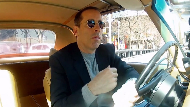
Jerry Seinfeld has written eight new Acura commercials in collaboration with Boston ad agency Mullen as part of the brand's title sponsorship of his web series Comedians in Cars Getting Coffee. The faux-vintage spots—all eight are posted below—will bookend new episodes of the show, coming Jan. 2. They were directed by Barry Sonnenfeld and inspired by actual old car commercials from the '60s.
But while those old spots sound a bit ridiculous these days (Seinfeld ran actual vintage Acura ads as pre-roll on Comedians in Cars last season), these new ads are intentionally silly—playing off the old style but taking it in absurd directions.
Seinfeld spoke with AdFreak on Tuesday about the creative process behind the ads, his experience with Super Bowl spots and what he thought of Will Ferrell's Dodge work.
So, these are fun spots. This must have been an exciting project for you.
You know, I have done a bit of advertising over the years. But I have never been given the creative freedom that I was given on these by Acura. They're gutsier than any other company I've ever worked with. Not that I've worked with that many, but I've worked with a few. Because this work, as you can see, is not like any other work that they've done. And usually—as you well know, being in the ad game—the clients tend to get nervous, especially when they're spending a lot of money. But [Acura marketing chief] Mike Accavitti, I've never seen a guy like this guy. Nerves of steel. It's pretty rare. But I think that's why they came out so good. I would give him all the credit.
Tell me about the creative process—how you worked with Mullen on these.
Mullen and I sat in a room together. Now, we ran vintage Honda and Acura stuff from the '60s and '70s last season on Comedians in Cars. And everybody kind of enjoyed that. And I said, Yeah, I've looked at everything that exists of the old advertising, and I picked out all the good ones. And I don't have any more. And I thought, Why don't we make new old advertising … that's bad. Because that's what's fun. A lot of the lines are stuff we actually found. We would put our little spin on it.
Alot of the advertising in the old days focused on the size of the car. People felt that you were really getting your money's worth if the car had a big trunk. Which of course is something that no one cares about now. No one buys an SUV and goes, "Well, how big is the trunk?" Because they're all big.
So, it's about taking the old tropes and pushing them a little bit.
Yes. And you know, to me, a lot of things have gotten worse that you could point to in our culture. A lot of advertising has gotten worse. I think it's kind of lost its nerve, to be honest with you. I feel like the advertising of the '60s, they were nervier. You know why? Because there was less at stake. It always worked. There were three networks. Everyone's going to see this. They're going to buy the car. And now, everyone's more nervous. Eyeballs are harder to get. And everyone's less inclined to take a risk.
You've seen those high stakes firsthand, having done Super Bowl ads for American Express and, of course, Acura.
Yeah. I've done a number of Super Bowl ads. And that is the best advertising of the year. That is when people realize they're going to be compared directly against other ads.
What did you think of Will Ferrell's ads for Dodge?
I like anything Will Ferrell does, so I was a fan of those. But it didn't seem to be a different type of car advertising. It seemed to be a different type of movie advertising. But different is always good.
So, you wrote a lot of the jokes for these Acura ads?
I did. We just wanted to get that feeling of "Hot, handsome and a honey to handle." Nobody says things like that anymore. Or "The perfect car for the big-car man." And the "Yesterday, today and tomorrow" thing. I like the little tension between the spokesman and the spokeswoman, that we can see that they aren't quite getting along.
My favorite thing is: "MDX. Three letters that stand for 'Earth, style and you.' " That's just like, nobody read that over and went, "What do you mean? Why does it stand for that? The letters don't even match up to that. Why are we saying that?" So, it's also part of the drunken, lazy ad culture of the '60s.