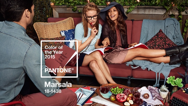
Designers always eagerly await Pantone's December announcement of its Color of the Year, predicting which hue will be ubiquitous in the year ahead. The 2015 Color of the Year, unveiled Thursday, is Marsala—a deep reddish brown. And it has some critics seeing more red than brown.
"It's a color that makes you want to go to Olive Garden or order Tampax in bulk," says New York Magazine's The Cut blog in perhaps the most scathing critique.
And for its part, Olive Garden seems elated.
@Joepardavila@Pantone We couldn’t be happier with the choice! We are lobbying for a new shade for 2016 called "Freshly Baked Breadsticks".
— Olive Garden (@olivegarden) December 4, 2014
Not all of the reaction to Marsala has been negative, but it does feel muted—perhaps appropriately so—compared to previous COYs like Tangerine Tango (2012), Emerald (2013) and Radiant Orchid (2014).

Marsala, meanwhile, is "a naturally robust and earthy wine red," Pantone says.
The executive director of the Pantone Color Institute, Leatrice Eiseman, further elaborates:
"While PANTONE 18-3224 Radiant Orchid, the captivating 2014 color of the year, encouraged creativity and innovation, Marsala enriches our mind, body and soul, exuding confidence and stability. Much like the fortified wine that gives Marsala its name, this tasteful hue embodies the satisfying richness of a fulfilling meal, while its grounding red-brown roots emanate a sophisticated, natural earthiness. This hearty, yet stylish tone is universally appealing and translates easily to fashion, beauty, industrial design, home furnishings and interiors."
Pantone's lead agency, experience design firm Sub Rosa, created the brand's overarching "Make It Brilliant" platform—and did the creative for the Color of the Year campaign, including all of the images here.

"To bring the color to life, Sub Rosa was tasked with creating a series of images that were as bold and exciting as the color of the year itself," the agency tells AdFreak. "To do this they created a print and social campaign that makes Marsala the star. The creative team worked closely with Pantone to ensure the tone and energy would drive the mood of an imagined 'place.' Sub Rosa organized this story through food, drink, cooking and friends coming together at various stages of an evening meal: appetizers, dinner and dessert."
"In each vignette, Sub Rosa meticulously planned details to create multiple layers that speak to the broad design audience. As this party moves from appetizers on the deck to dessert by the fireplace, Sub Rosa played into varying elemental associations and feelings that Marsala evokes by appropriately adjusting the character and contents of each 'room.' "
So, what do you think of the choice of Marsala?


