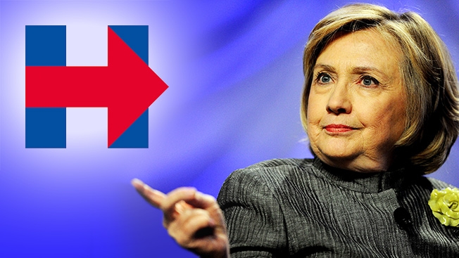
It wouldn't be an election season without a full-on Internet-fueled art-school-esque critique of a candidate's logo. This week's victim: Hillary Clinton!
I'm running for president. Everyday Americans need a champion, and I want to be that champion. –H https://t.co/w8Hoe1pbtC
— Hillary Clinton (@HillaryClinton) April 12, 2015Along with her campaign announcement on Sunday, Clinton showed off her new logo—a big blue H with a red arrow striking through it, pointing to the right. Of course, the Internet freaked out and issued a torrent of snark-laden reactions to the design.
Critics commented on everything from the direction the arrow is pointing to other logos it reminds them of (cough, FedEx, cough) and of course made some other super-tangential-oddball associations.
What do you think of the design? Is it actually bad, or do people just have it out for Hillary?
If you turn the Hillary Clinton campaign logo sideways and drive over it with your car, you get a speed boost. pic.twitter.com/gunMmrT2Op
— Pat Mullin (@PatsHoppedUp) April 12, 2015
Hillary's logo is better rotated 90 degrees clockwise. Equality is going down. pic.twitter.com/79zA0xvuBr
— Anthony Bialy (@AnthonyBialy) April 12, 2015
Our @JoelFrewa has already corrected Hillary's new logo! #WhyImNotVotingForHillary ==>> pic.twitter.com/I5Xxg2ual7
— THE POLITISTICK (@ThePolitiStick) April 12, 2015
More accurate version of Hillary's logo. pic.twitter.com/g61ws74K3Y
— Razor (@hale_razor) April 13, 2015
My first reaction to the Hillary logo is that it looks like it belongs on a 90s Nautica windbreaker pic.twitter.com/mFo9CPYvyq
— Nick Horowitz (@ztiworoh) April 12, 2015
I don't mean to brag but it was actually my 4 year old who designed the Hillary logo for #Hillary2016#HillaryClintonpic.twitter.com/xKbQyx52SQ
— Tom Greever (@tomgreever) April 13, 2015
Hillary Clinton's new logo or sailor shirt: a comparative analysis pic.twitter.com/e70CZPC6sS
— Ben Greenman (@bengreenman) April 12, 2015
Hillary campaign logo = FedEx + The Who pic.twitter.com/TMEINpjRNd
— Kristie Lu Stout CNN (@klustout) April 13, 2015
Hillary's logo is really distinctive. #design#brandingfailpic.twitter.com/OEfWvH66Vs
— Jackie Rivera (@JNR4thewin) April 12, 2015
Take the Costa Rican flag, flip it, add in the Cuban flag, scroll, add Fedex, make into square, get Hillary logo. pic.twitter.com/xnKYwTKD1I
— Wesley Verhoeve (@wesleyverhoeve) April 12, 2015
Hillary Clinton's logo promises to return our nation to the greatness of late 1970s NBC. pic.twitter.com/GWlpvjlJcS
— Chris Regan (@ChrisRRegan) April 12, 2015And people got super weird too.
Hillary Clinton's logo before photoshop pic.twitter.com/ufmQKqpoBJ
— mar10 (@guy_irl) April 13, 2015
i dunno why everyone's hating on Hillary's campaign logo, i like it pic.twitter.com/wMmllI3TnJ
— Noah Baumbaclaat (@alshipley) April 13, 2015
Hillary's new logo is even worse than the first one: pic.twitter.com/KuVWESaJOt
— Kill Tim Faust (@crulge) April 13, 2015
Hillary Clinton's logo is a joke. What an absolute letdown. pic.twitter.com/XrqOJNDPj6
— Aaron Sechrist (@okpants) April 12, 2015