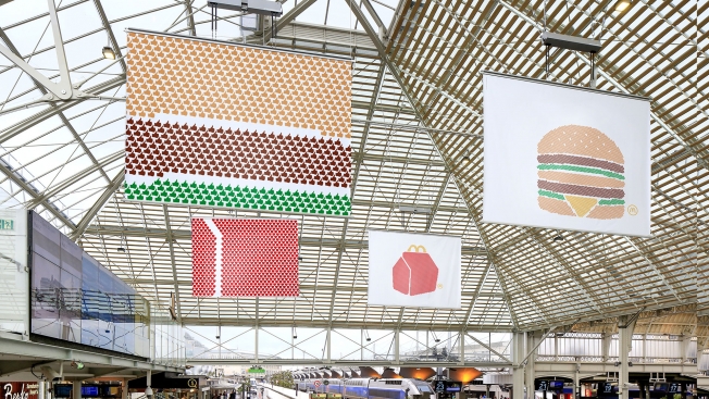
McDonald's in France makes some of the most spare, striking outdoor ads anywhere. For the past couple of years, the OOH ads have shown just the menu items, with almost no branding at all—first in closeup photography, then with simple drawings of the products.
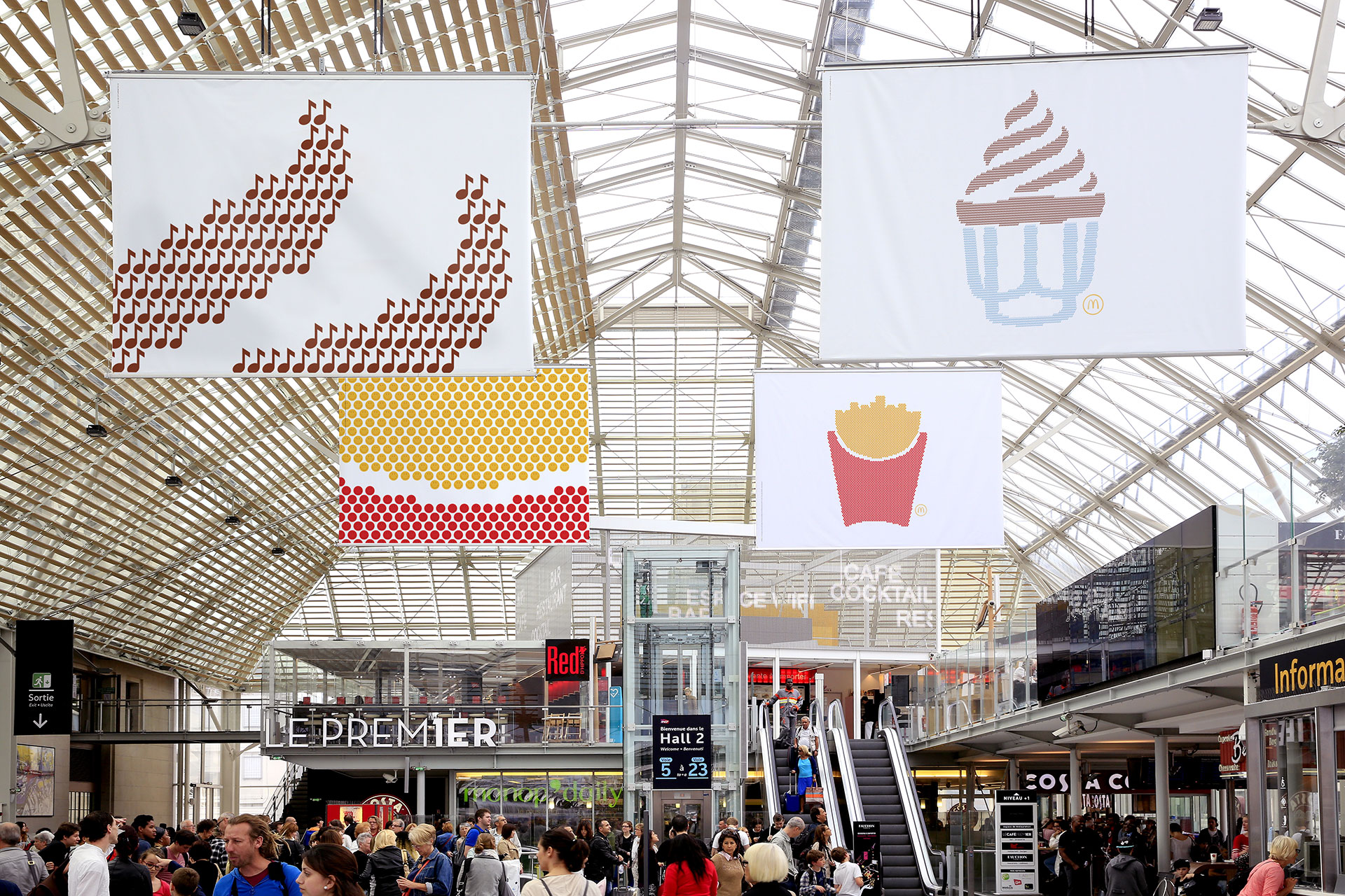
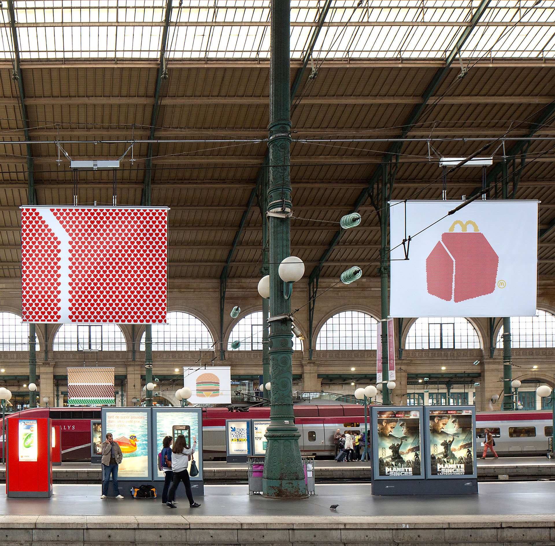
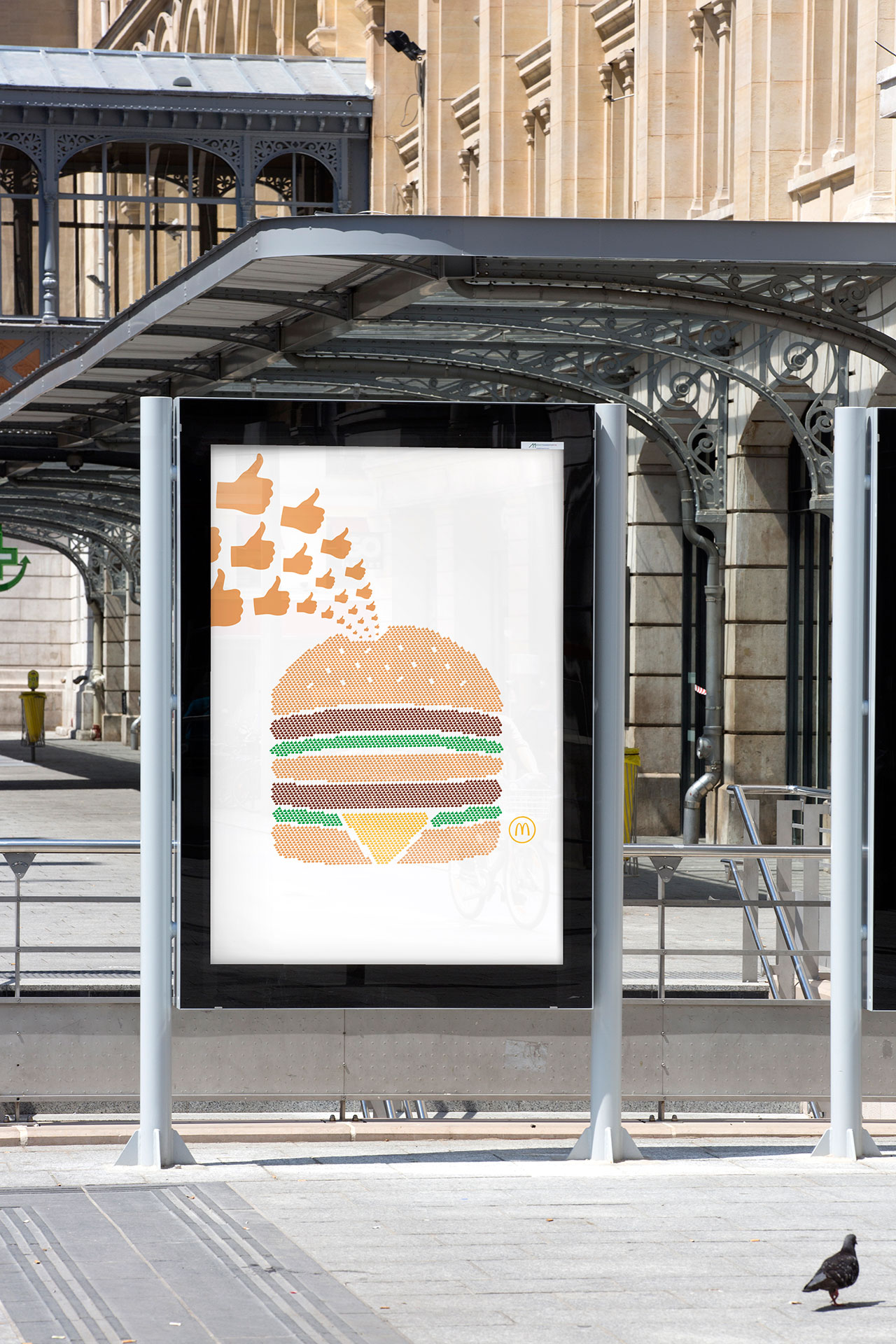
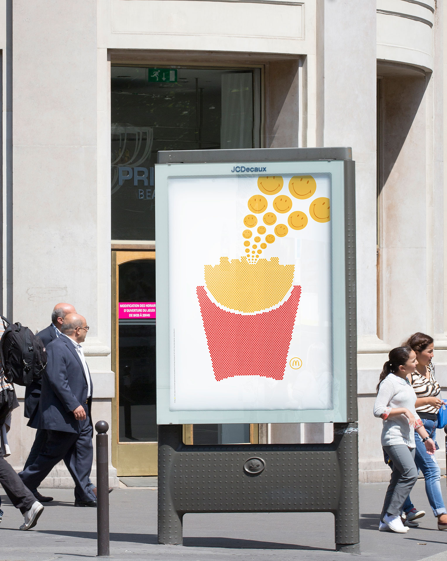
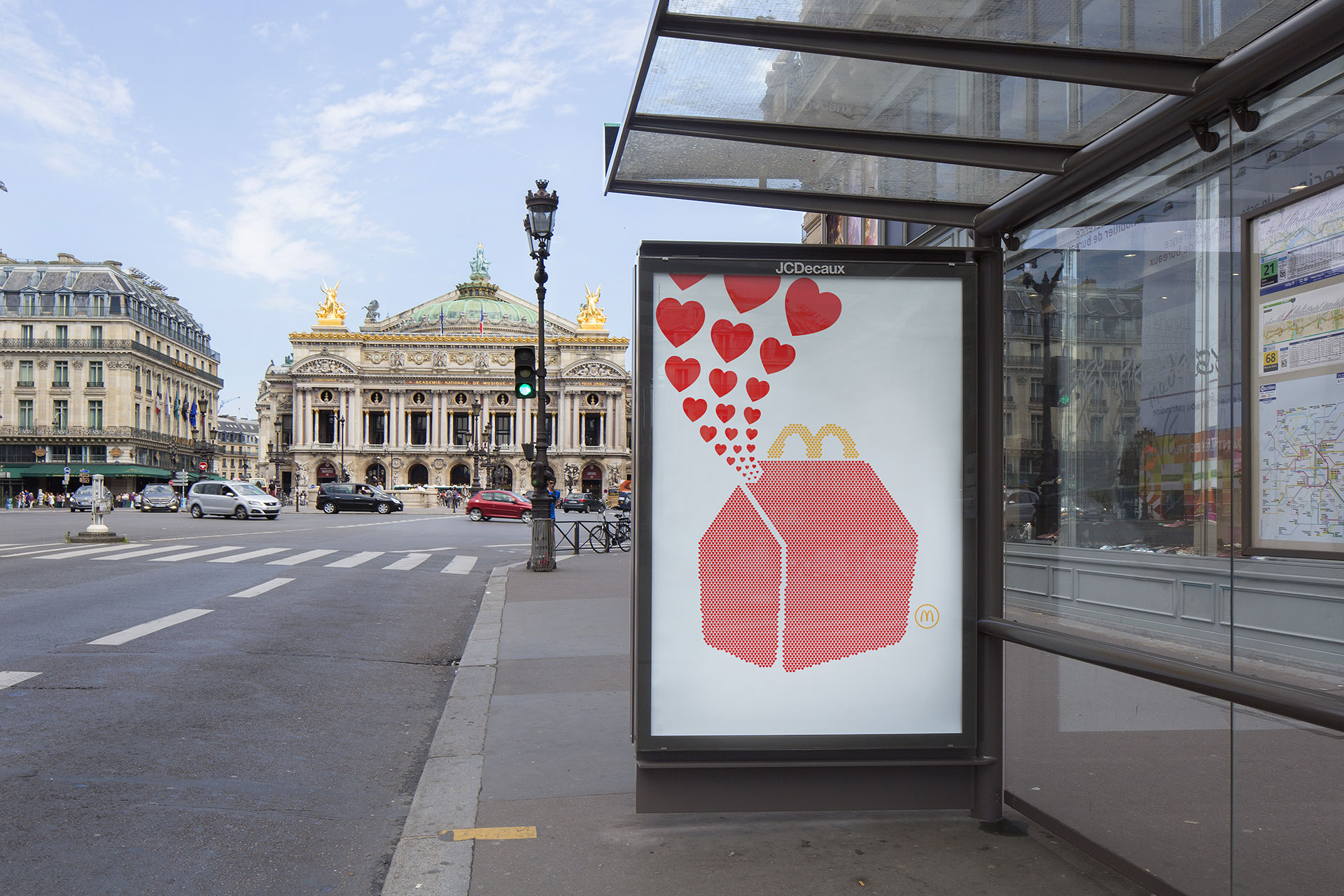
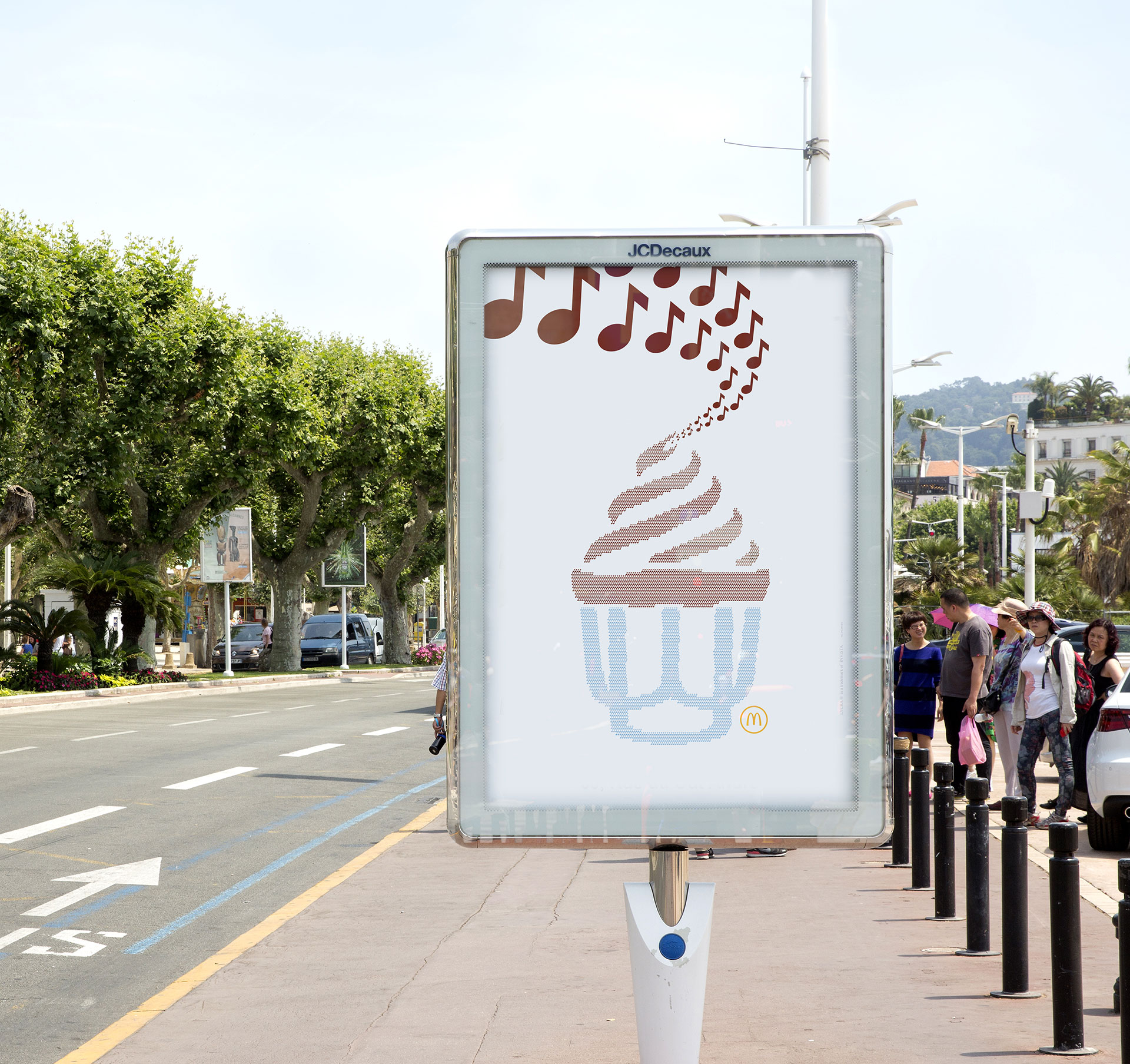
This summer, the brand, working with TBWA Paris, is evolving the campaign by adding emojis to the images. (Emojis are now a requirement of every ad campaign everywhere, by the way.) The product drawings are now made up, pointillist style, of tiny emojis—reflecting the emotion stirred by the products.
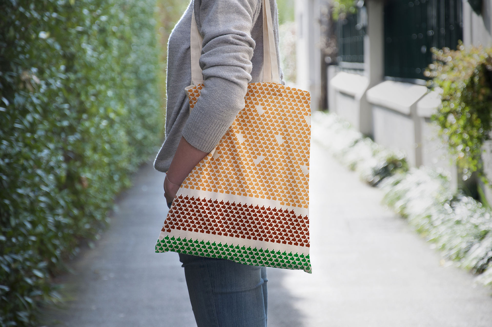
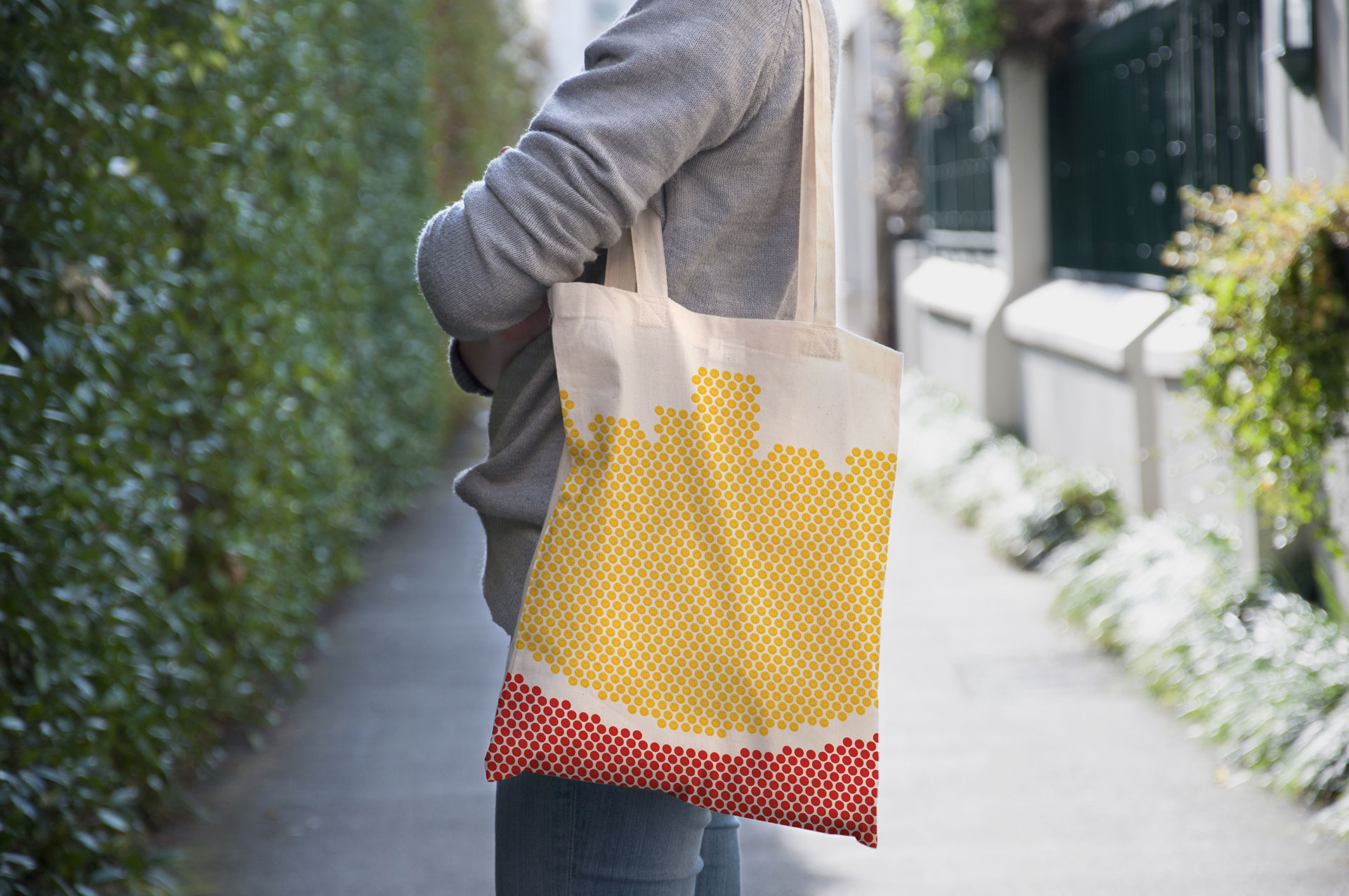
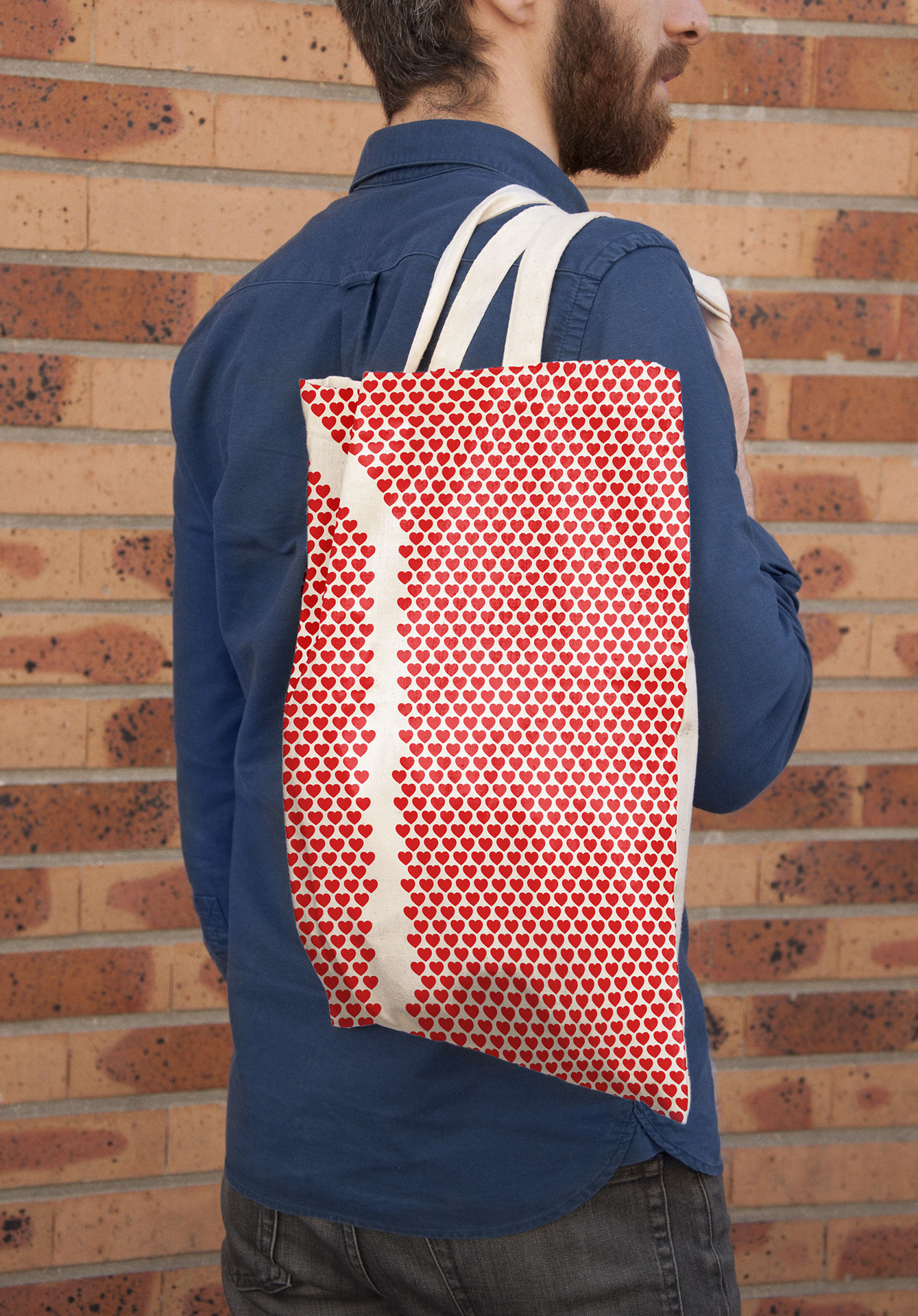
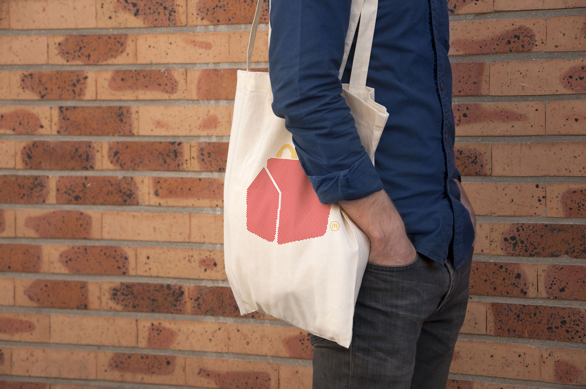
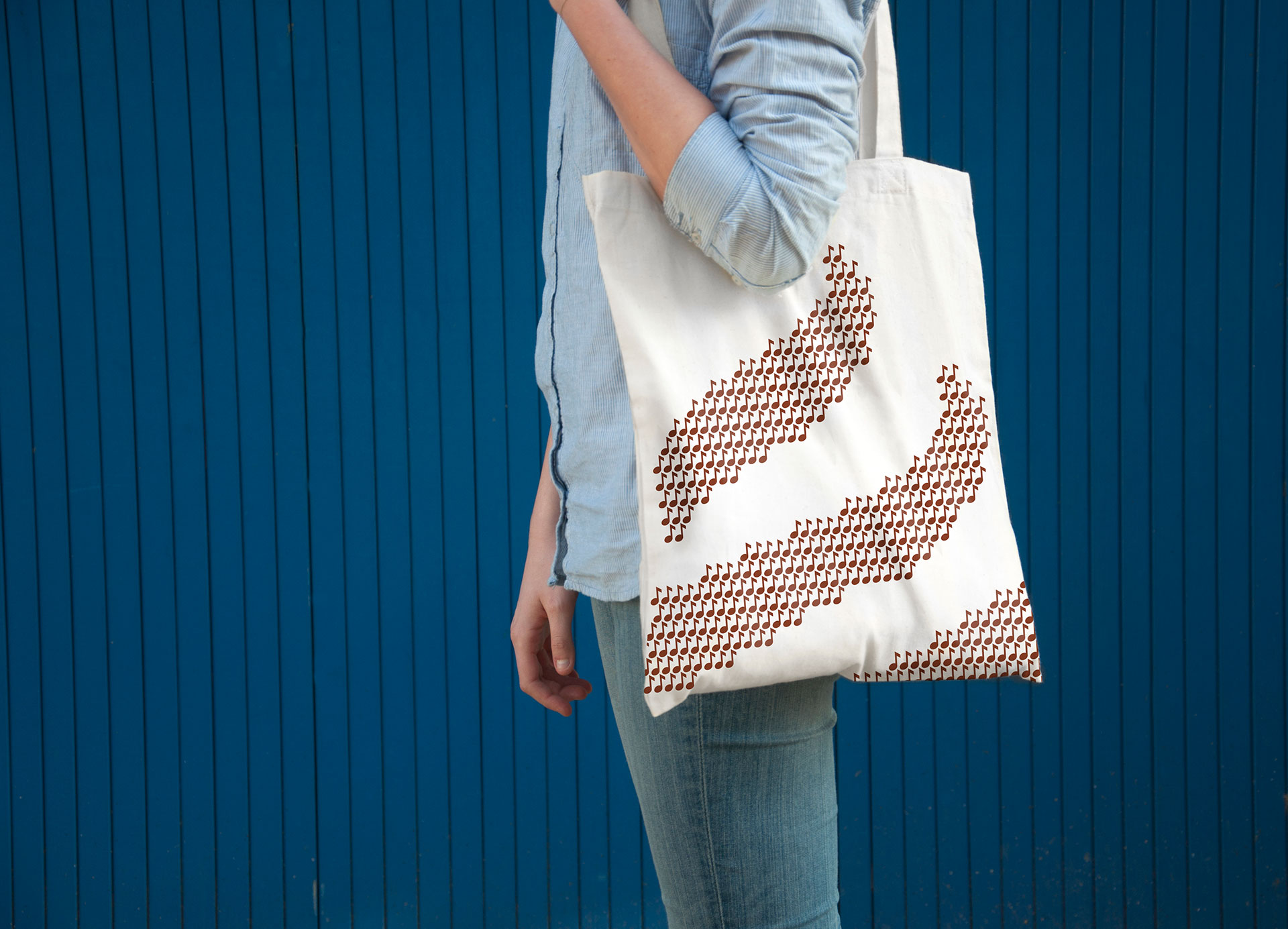
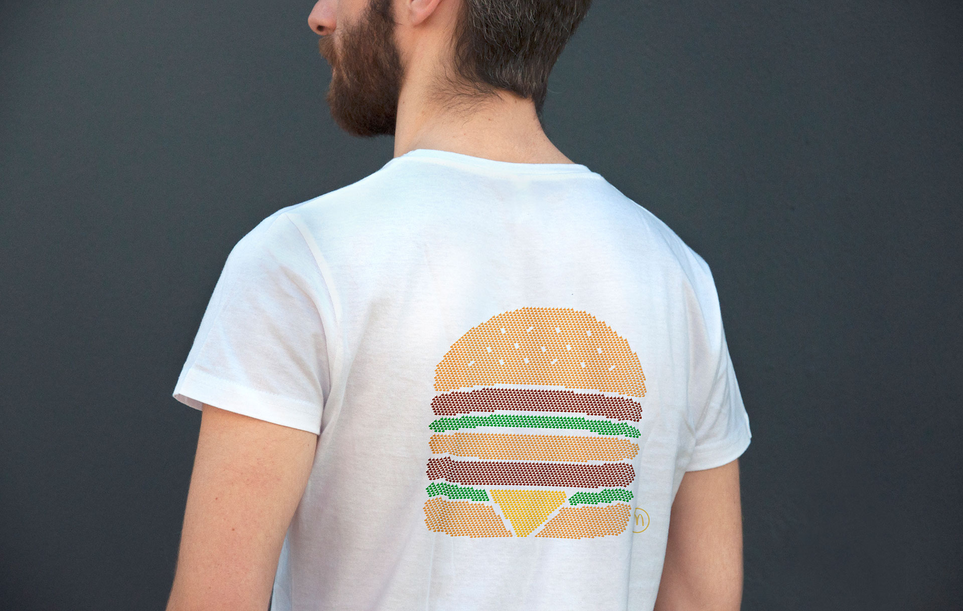
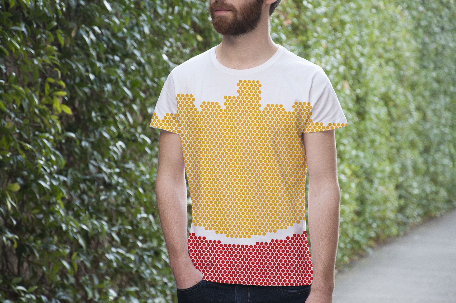
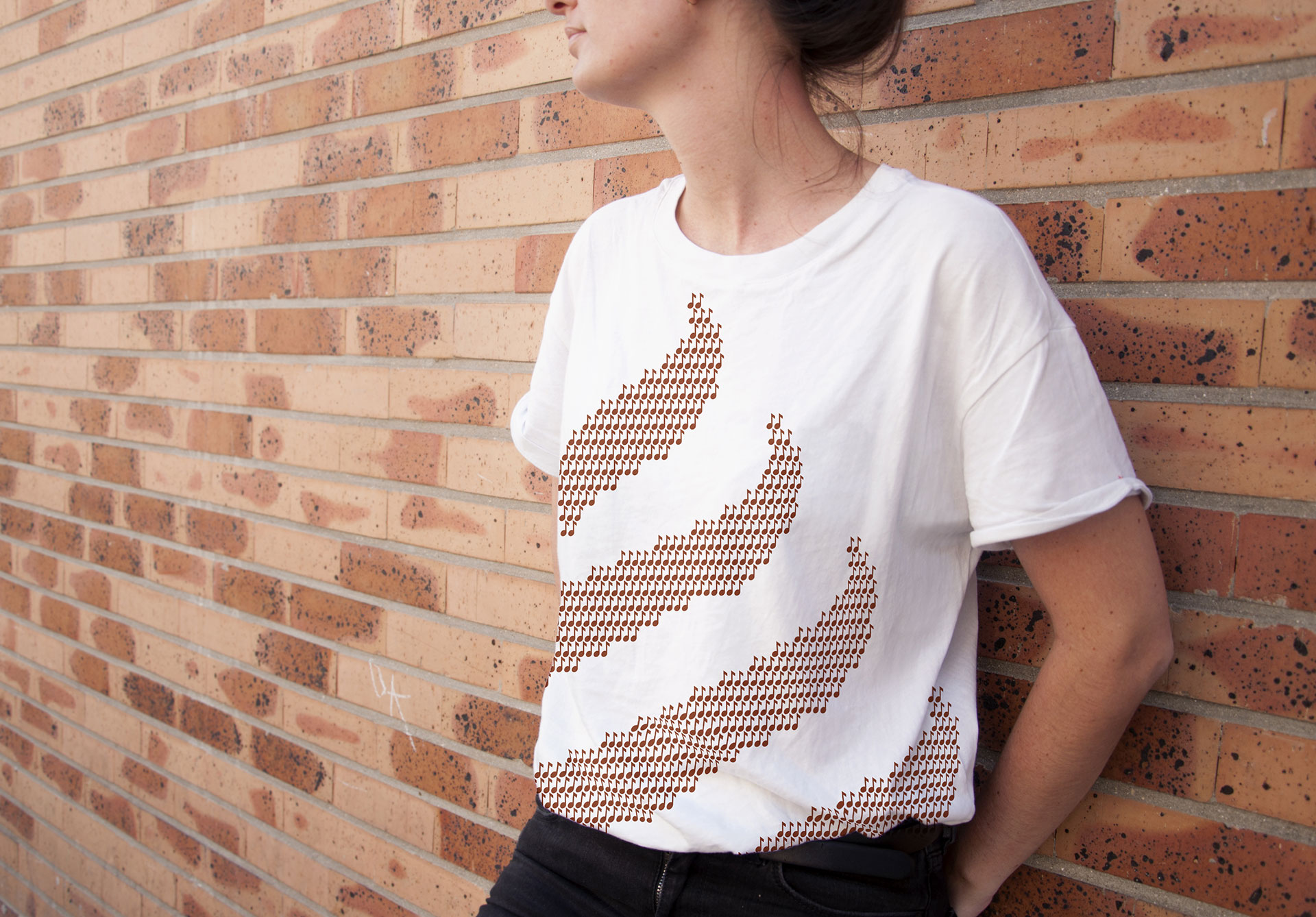
For example: The Big Mac is made up of hundreds of little thumbs-up signs; the fries are made from smiley faces; the sundae from musical notes; and the Happy Meal from heart symbols. (Those are the only four menu items highlighted this time. The Happy Meal is new to the campaign, while the Quarter Pounder, Filet-O-Fish and Chicken McNuggets have been dropped from the ads.)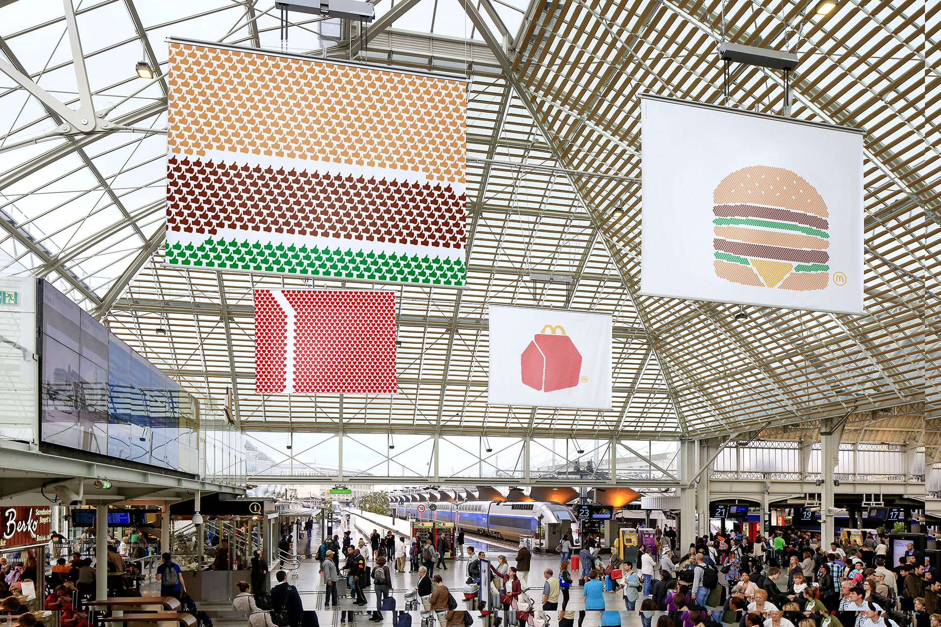
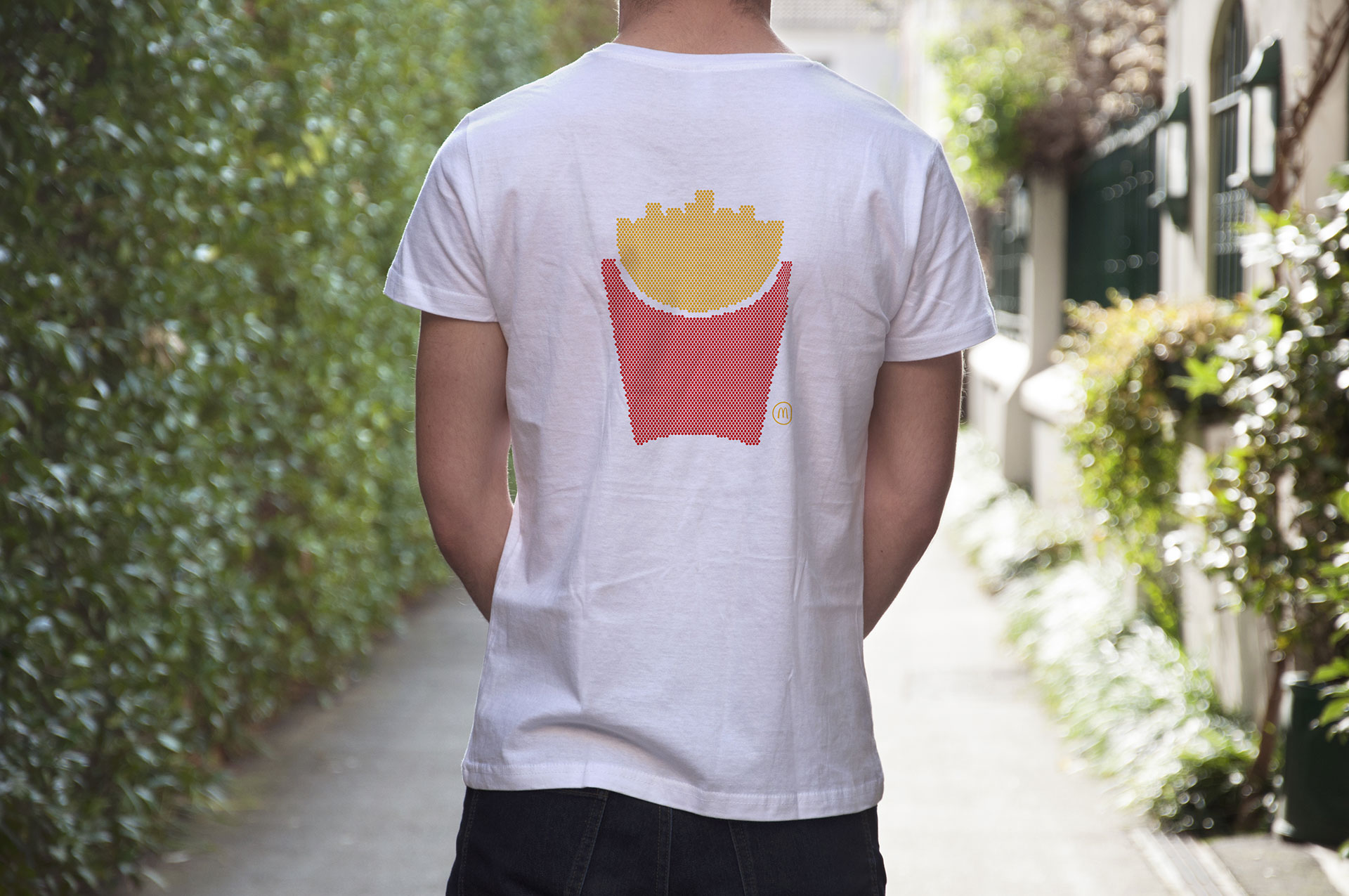
McDonald's says the "pictograms" campaign has "placed the brand at the heart of the pop culture." Indeed, the marketer clearly believes the work is practically high fashion. This year's campaign includes a McDonald's collection at Colette, the Paris fashion and lifestyle store, consisting of six products bearing the campaign's imagery—T-shirts, tote bags, scarves, iPhone cases, notebooks and postcards.
See the rest of the images below.
The outdoor ads:
The Colette collection:
