Now that Google and Verizon have sparked global design debates by redesigning their logos, it makes sense to ask who should be next.
I mean, other than Yahoo.
Looking beyond the tech and telecom megacorporations, there's one classic brand logo that nearly every designer—or human with eyes—would like to see reworked: Sherwin-Williams.
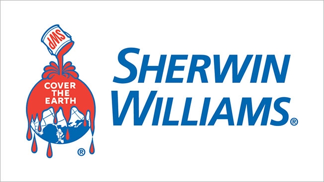
The paint brand's "Cover the Earth" logo infamously shows red paint being poured across our planet's verdant surface and teeming seas, with the titanic droplets defying gravity itself to drip further into the solar system.
Such an industrial vision for a better (or at least consistently colored) world probably made perfect sense when the logo was created in 1905. But in the era of environmentalism, it's become quite the unusual relic of corporate iconography.
That said, it certainly isn't hated by all. In fact, the company briefly abandoned the logo in 1974—feeling it did not reflect an "environmentally aware, diversified manufacturer"—only to return in 1982. It's remained the official corporate identity ever since.
This morning, I asked design legend Milton Glaser, creator of the iconic "I [Heart] NY" logo, what he thought of the Sherwin-Williams mark. He was unapologetic in his praise for it.
"I love the Sherwin-Williams logo. It is one of the most persistent and memorable surrealist images of our time. The image of paint entirely covering the Earth is as powerful as anything Magritte or Dali ever produced," he said. "Of course, it no longer looks as though it belongs in the design vocabulary of our time, but ultimately that may turn out to be an asset."
Of course, not everyone shares Glaser's appreciation for the incongruous icon.
In 2006, a blog called Earth Friendly Gardening asked the brand to change the logo, which the author felt was "perverse, sinister, and, frankly, ridiculous in this day and age."
In 2011, the Sherwin-Williams logo was "the nearly unanimous choice" by Fast Company readers when asked which corporate logo was overdue for a makeover. Readers called it everything from "pro-pollution" to "absolutely awful."
So, now that Google and Verizon have primed the world's design community for a fresh set of logos to critique, is it a good time for Sherwin-Williams to get a surprise makeover?
The brand's reps haven't responded to my request for comment. But after they read all my loving words, I'm sure they'll show me their appreciation in the same way they show it to our shared home world—by pouring a big can of paint over my head and whispering, "Shhhhhh, cover the hater."
UPDATE: I heard back from Sherwin-Williams shortly after this post went live.
Below are the responses to my questions from Mike Conway, director of corporate communications for the brand.
Adweek: Would Sherwin-Williams consider a logo redesign? Is one already in the works?
Conway: The Sherwin-Williams logo, which first appeared in 1893, is one of the most recognized in the world. It is not meant to be taken literally, rather it is a representation of the our desire to protect and beautify surfaces that are important to people. At this time there are no plans to redesign the logo.
How do you respond to critics who say the logo feels outdated and conveys an environmentally insensitive tone?
Sherwin-Williams is committed to making the world a better place to live and for decades we have had a number of sustainability initiatives underway. From products that meet the most stringent environmental regulations to how we run our business, we believe our actions and track record demonstrate the commitment we have for the environment. (S-W has received a national "Green Chemistry" award from the EPA. We created a new green, water based formula around soybeans. S-W has long been recognized for its "green" water-based paints.)
What are the primary reasons the brand has stuck with this logo for so long?
Our logo represents our history and our heritage. For 150 years we have worked to provide the best products and services to our customers around the globe. We hope that this explanation provides you with a different perspective to consider.