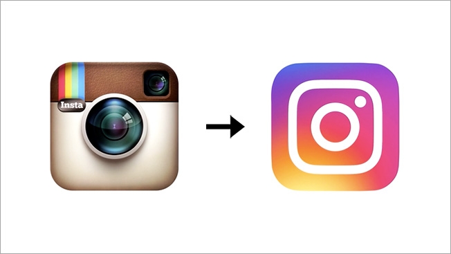
Instagram unveiled a new logo Wednesday, and it may well go down as one of the biggest design fails of the year.
The brand's famous skeuomorphic icon, a virtual representation of a physical camera, was beloved almost universally, and is one of the most instantly recognizable logos in tech. For some reason, Instagram felt it was dated. It was "beginning to feel, well… not reflective of the community, and we thought we could make it better," Ian Spalter, head of design at Instagram, writes in a Medium post (which also goes into its new, broader visual identity).
The ellipsis in that sentence is telling. It seems to indicate a confusion of purpose. If only the ellipsis had turned into a real pause—and they'd put on hold this instinct to ditch the key symbol of the brand's personality.
As often happens with logo redesigns, Instagram goes into great detail about the creative decisions that went into this one. The brand says it started off trying to "modernize" the original mark. That produced a "brighter, flatter option" that wasn't working. So, they began an effort to work the rainbow and camera lens into a different mark entirely—hoping to produce "a more modern app icon that strikes a balance between recognition and versatility."

"The question then became, how far do we go?" the brand says. "If you abstract too much, the glyph doesn't feel tied to the history and soul of Instagram. If you make it too literal, it's hard to justify changing from what we currently have. After a lot of refinement, we landed on a glyph that still suggests a camera, but also sets the groundwork for years to come."
In the end, they reworked the camera glyph into an almost completely abstract image, and took the rainbow and used it as the basis for a colorful gradient background.
Unfortunately, while it may render better in some environments, it's a very forgettable image that will get lost on people's phones amid the thousands of other similarly uninspired designs of most tech apps. It's a bit baffling how this is considered an improvement—indeed, why they felt there was a need to "modernize" at all.
Can we change it back?
Check out one more brand videos about the change below.