There's an old legend in advertising that goes like this: David Ogilvy was walking past a homeless man one day whose sign read: "I'm blind, please help." His cup was empty. Instead of giving him money, Ogilvy rewrote the sign to read: "I am blind, and it's spring." The cup soon overflowed with cash. Tada—a lesson in the power of storytelling.
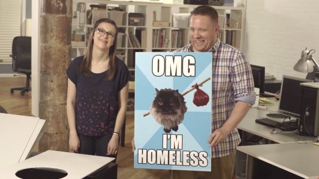
Of course, stories that work in legend don't always work in reality, or so it seems when you try to apply the tricks of modern advertising to today's homeless signs. Writing team the Bilderbergers and director Ben Weinstein created a fictional project called Better Homeless Signs, bringing more compelling copy and design techniques to the traditional cardboard placard. Witness the sexy homeless sign, the meme-based homeless sign, and the prototype edible homeless sign (that's gotta be up for an award).
Of course, some real graphic designers have been doing this in an earnest manner since 2012. The way advertising is today, who knows how they afford the overhead. The takeout costs alone must be legendary. Full credits here.