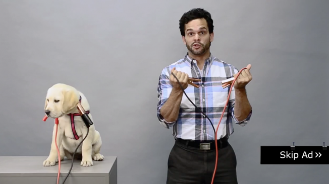
The numbers don't lie: When a YouTube preroll ad comes on, users are primed to click the "Skip Ad" button the very millisecond it appears on screen. Research says 94 percent of preroll gets skipped shortly after the first five seconds (which are unskippable). And frankly, that number seems low.
The seemingly obvious solution is to make the first five seconds so compelling that people have to watch the rest—rather than just post your TV spot and hope for the best. Embracing the former, ad agency Nail in Providence, R.I., did a simple experiment. It tried to come up with an unskippable YouTube preroll ad.
See the results below.
It's not very subtle, and it uses a trick from an old National Lampoon magazine cover. It's also super low budget. Yet it got a view rate of 26 percent, which is impressive. And it made a few bucks for charity along the way.
What do you think? Is it worth building ad executions specifically to work better as YouTube preroll? Or is that just too much of a bother?
Here is Nail's blurb about the dog video:
As marketers, it's time we change the way we do YouTube preroll.
The current model seems to be to simply throw your TV commercial in front of any video a loosely defined demographic happens to be watching.
What a missed opportunity. The skip rates are unbelievable (94 percent is a generous estimate). And when there is no skip button, you can practically feel the resentment oozing through the Internet. Hardly the temperament most brands want to inspire from their customers, right?
Yes, content is king. But here, context is also king. (A gay royal couple if you will.)
Think about what we know at that moment: we know what they're going to watch, we know what they just Googled, we know where they are, we know what device they are watching on, heck, we know they can skip the ad. All of this information is an opportunity to customize a message that respects the viewer and the platform.
We need to stop repurposing content designed for other channels and start taking advantage of the amazing abilities YouTube is throwing at us.
It's like we're NASA and we're only using the Hubble Telescope to look at our neighbor's boobs.
YouTube ads should be designed for YouTube. They should use the tools and features given to us and interact with the user and the platform in a way that can't be rivaled. They should be self-aware. They should talk to one person at a time.
What the heck are we talking about, you ask?
OK, here's an example. We wanted to raise awareness and money for an organization near and dear to us: the ASPCA. We had virtually no money but had given ourselves a serious challenge: can we make a skippable YouTube that virtually no one skips?
Did we do it? You tell us.