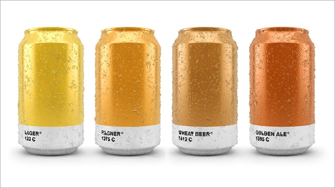
If you always suspected that a pale ale would rate a shimmering, golden 604C on the Pantone color system, have a pint on me.
Spanish agency Txaber matches brew types with their Pantone hues in this stylish package design exercise. It's reminiscent of last year's "Beertone" cards that provided the exact color values of various beers in RGB, CMYK and HTML code. Here, however, we get simple, gorgeous cans and bottles that really let the shades of the suds inside shine through.
See the whole collection on the Txaber site.
Beer packaging has been a powerful muse in the design world, inspiring some impressive work. The comeback of the can, particularly among craft brewers, "opened up a 360-degree canvas for label designers typically restricted to the few stickers on a beer bottle," according to my AdFreak colleague David Griner. That's true, though some creative types have made heroic efforts to sass-up humble glass containers and do that medium justice, too.
I like Txaber's restrained, elegant approach. You get lots of color and, in tiny typeface (HipstelveticaFontFamily, which is free to download), the beer names and Pantone designations. That's all you need. The results are especially compelling when the cans and bottles are grouped together. Their hues play off one another like the bands of a rainbow, ranging from pale ale's carefree vibrance through the playful, almost purplish tones of the porter's 1817C to the dark grandeur of imperial stout at 426C.
Though, as we've learned, nothing represents the vibrant soul of "black" quite like Guinness.
Via Design Taxi.