Ad agency The Bull-White House's "Cancer Sutra" campaign was a provocative idea in search of a sponsor—until Stupid Cancer, a nonprofit dedicated to helping young adults with cancer, signed on.
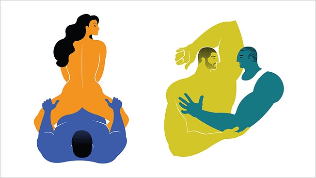
Central to the effort, which coyly suggests you can spot signs of cancer while having sex, is a series of colorful posters, designed by Brooklyn artist John Solimine, showing couples in the act. Sales of the posters will raise money for Stupid Cancer, and Bull-White House hopes to turn some of them into wild postings. There's also an e-book, website and video.
Agency founder Matthew Bull discovered Solomine on Behance.net and was drawn in particular to "Strongman Love," an illustration of a man with his arm wrapped around a woman that Solimine made about four years ago. That visual style defined the new campaign. (There are lots more images here.)
As Bull explained, "Curvaceousness, hard angles, a playful approach to negative space—all of these were critical in differentiating the Cancer Sutra from any other Kama Sutra we'd seen before."
AdFreak asked Solimine about the making of the posters.
When did you first get the call for this?
It was late last year when I got a call from Bull-White House. It was funny because upfront, from the call, I had no idea what the project was.
What was the initial brief?
They started off with the statistic that a huge amount of people who find out they have cancer actually discover it before, during or after sex. ... When you tell people about it and use that as an intro, people are like, "Wait a second." Just the words cancer and sex in the same sentence—probably you've never heard that before, you know?
Why did you want to do this?
The scope of it, the size of it. They said, "We're going to need between 20 and 40 illustrations" at the beginning of the whole thing. And just the subject matter I thought was great. When it was pitched to me, I was like, "Wow, I've never heard that idea before." So, I found it unique. And I've had family members who were stricken with cancer.
What inspired the look and feel of your posters?
An old poster that I had done for Fab, that website fab.com. ... They would partner with various artists and have that artist come up with half-dozen or so unique pieces that were just for the Fab sale. And then you could sell anything else you wanted of your previous work on there. But one of the posters I created for my Fab sale ("Strongman Love")—Bull-White House had seen that on my website and they kind of pulled that out stylistically and said, "We really like what you're doing with this one."
What was it about that poster?
I don't think they wanted it to be anatomically [correct] or lean too much on that. They wanted it to be playful, have interesting body shapes and not go for Ken and Barbie or Penthouse and Playgirl, that kind of thing, and not have it be too porny in any way.
It must have been tricky to straddle that line.
At that first meeting, just to clarify what we were going to be doing, I was like, "So, I'm going to be drawing people actually having sex in various ways, right?" And I think in the beginning everybody thought that yeah, you are, and it's going to get pretty graphic—like there's really no way around it for what we're talking about.
But then when we actually started doing the illustrations, working on them and being collaborative, we all realized that there was a way that we were going to be able to pull it off without actually showing anything, which I actually think became the trick of it, like, "OK, how can we show pretty graphic descriptions of sex without actually showing anything at all, really?" I think all you really see graphically are like two or three nipples maybe. So, I think the suggestion of it is the strength of it.
I could see this on T-shirts. Could you?
Oh, yeah, definitely. I think there are a lot of cool applications. They were jokingly talking about turning the pattern into sheets, pajamas or something like that.


